Never Never
A multiplayer party game for phones, and one of my first UX projects.
Overview
A mobile, multiplayer take on Never Have I Ever, designed for friends and a few drinks. I was the main gameplay designer and UX designer on a small Howl Studio team, and we took it as far as a prototype.
01 · Define the project space
How might we make a game that plays to our technical strengths?
Never Never is a multiplayer mobile take on Never Have I Ever: fun, a little cheeky, and made for adults to play together on their phones.
First, we looked honestly at ourselves. A SWOT analysis of the team set the boundaries for everything that followed.
Strengths
- UI design skills
- Unity platform
- Research
- Senior games developer
- Senior project manager
Weaknesses
- 3D design
- UX development experience
- Gameplay theory
Opportunities
- At-home development time
- A captive audience
- Keen to gain experience
- Momentum of graduation
Threats
- Time constraints
- Unity learning curve
- Inexperience
SWOT insights
- Create a mobile game
- Build in a 2D Unity development setting
- Lead with UI and iconography based design
- Make the gameplay narrative driven
- Aim for a December 2021 release
02 · Topic analysis
Playing the competition
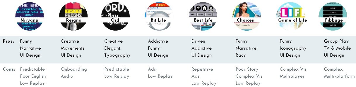
Next we looked at what already worked. We played eight games and recorded our experiences, narrowed to a favourite few, watched others play, then ran a heuristic evaluation and SWOT analyses.
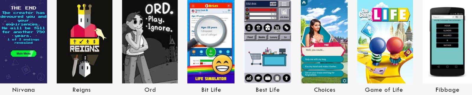
Gameplay insights
What worked
Humour, narrative and strong UI design.
What didn't
Low replay value, predictable play and interrupting ads.
A heuristic evaluation of Reigns
Reigns, a swipe-to-decide card game about ruling a kingdom, was our favourite, so I evaluated it against Nielsen's heuristics.
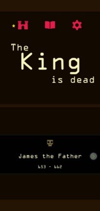
Heuristic 1
Visibility of system status
Success. A dynamic health meter shows instant changes, and swiping a card reveals the options.
Improvements. Create onboarding, make the start game button more evident, and show the number of cards left in the deck to encourage more strategic moves.
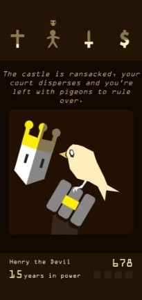
Heuristic 2
Match between system and the real world
Success. The health meters are represented well; a cross stands for the church.
Improvements. Differentiate between the types of gameplay cards. Game content, such as names and terms, is not well known.
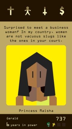
Heuristic 8
Aesthetic and minimalist design
Success. The screen is not cluttered with competing words and images, and the UI is clean.
Improvements. The cards are dialogue heavy to set the scene, and could be simplified.
03 · User research
Who we were designing for
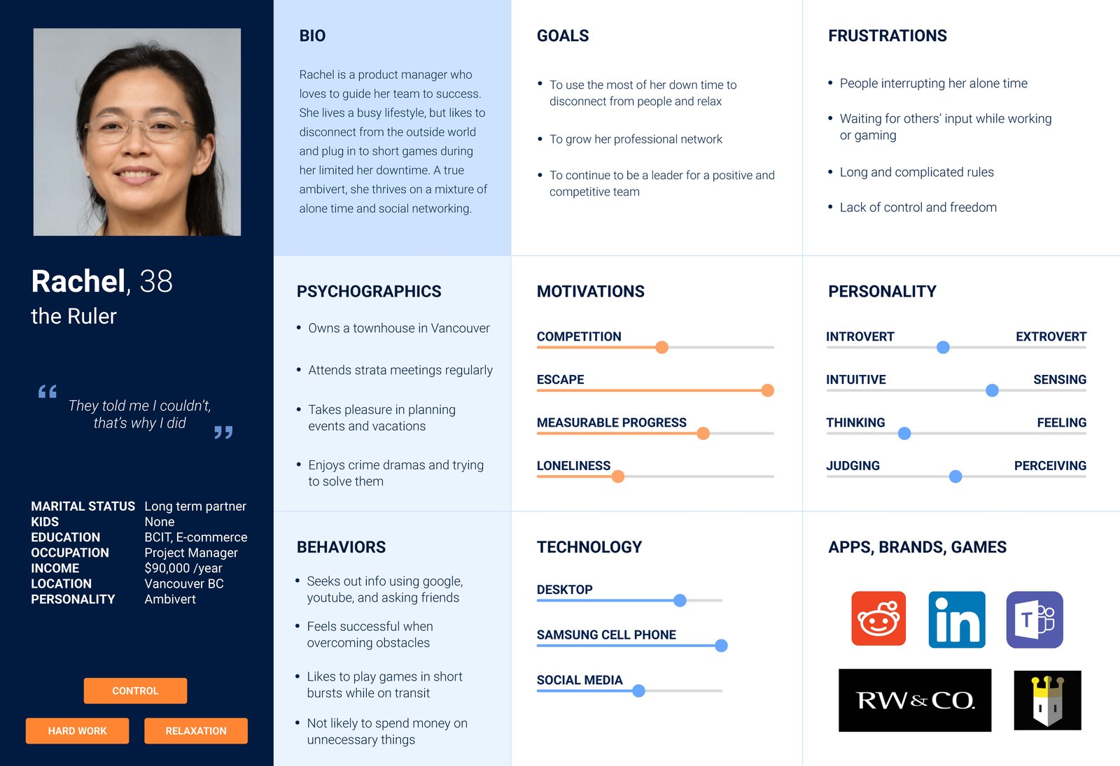
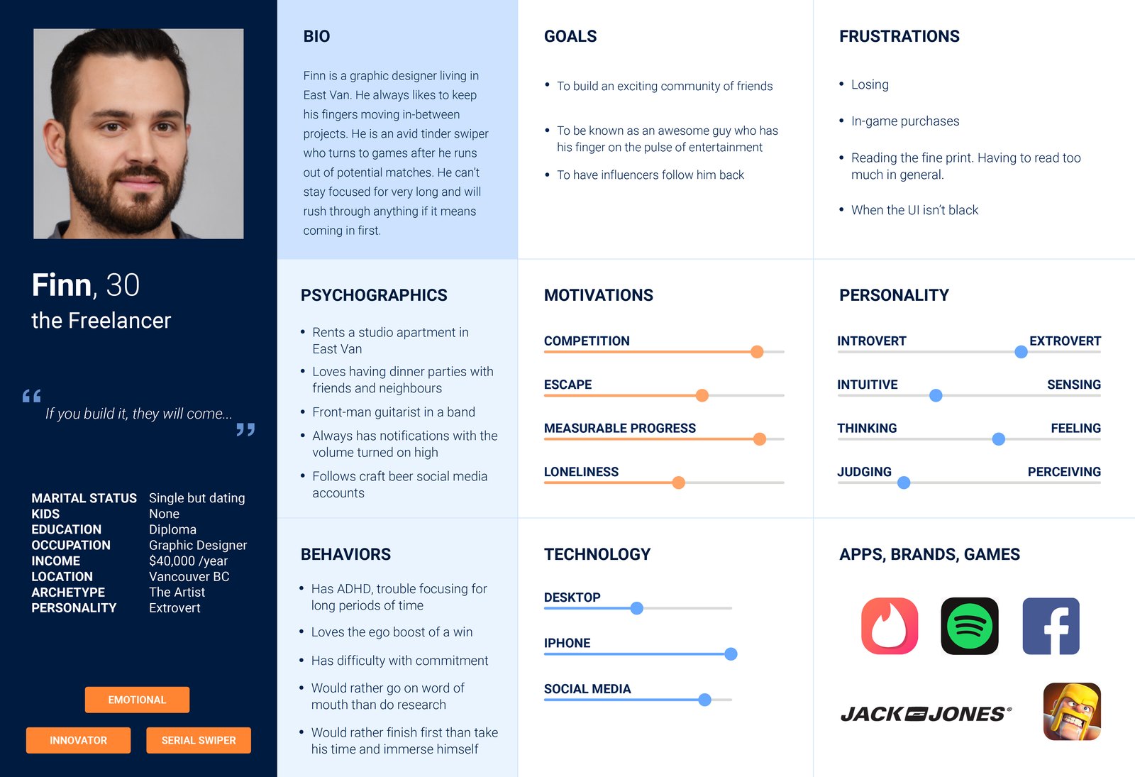
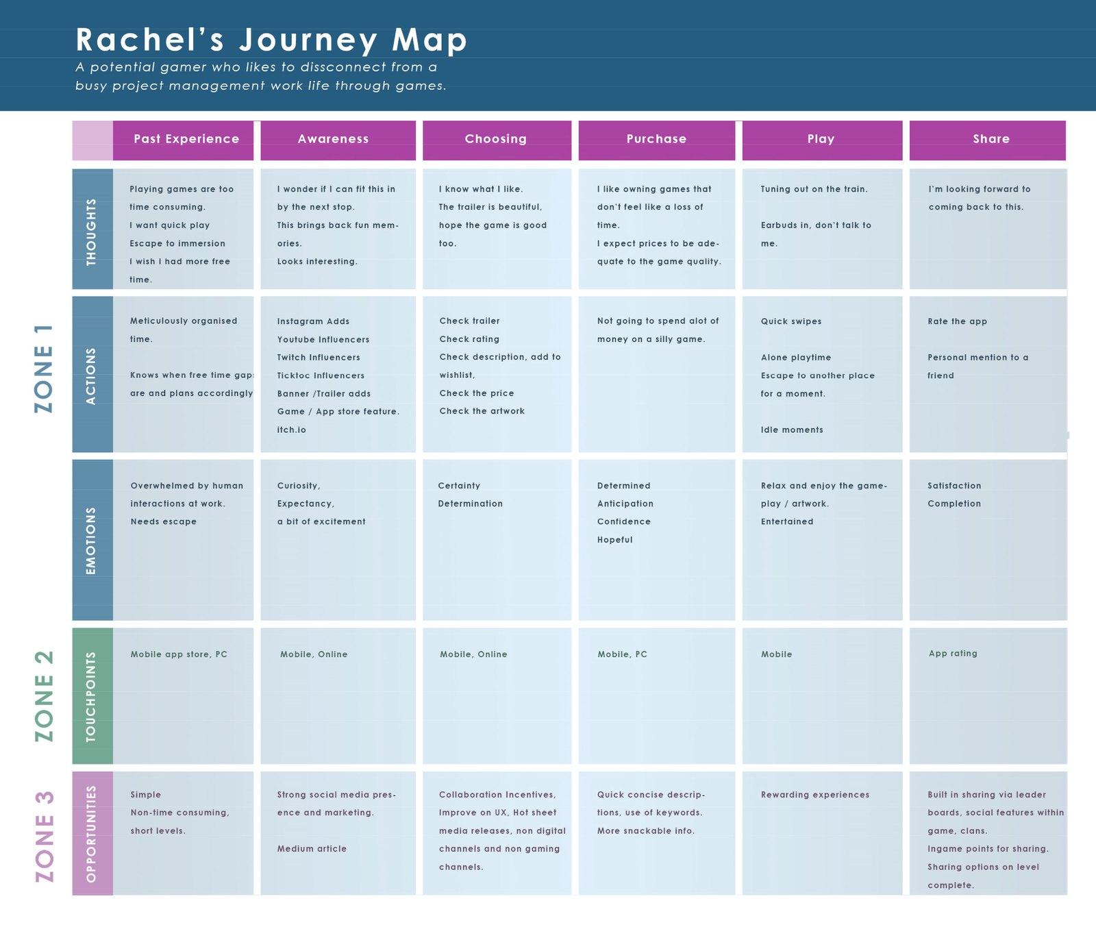
An online survey shaped our market segments and one-on-one interviews, which became personas, a journey map, and task and user flows. Two personas came out of it: Rachel, the Ruler, and Finn, the Freelancer.
04 · How research influenced design
Designing the game
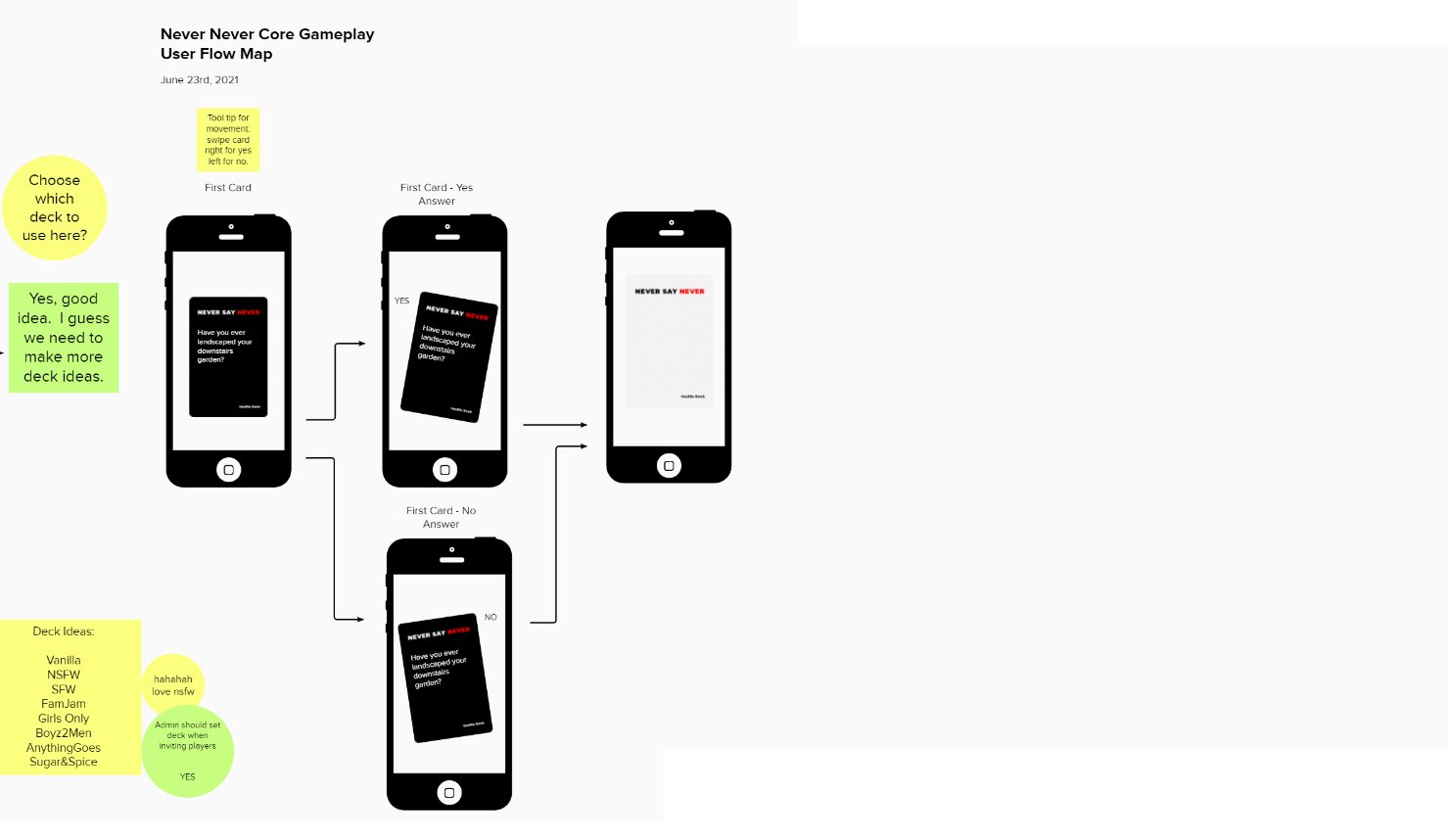
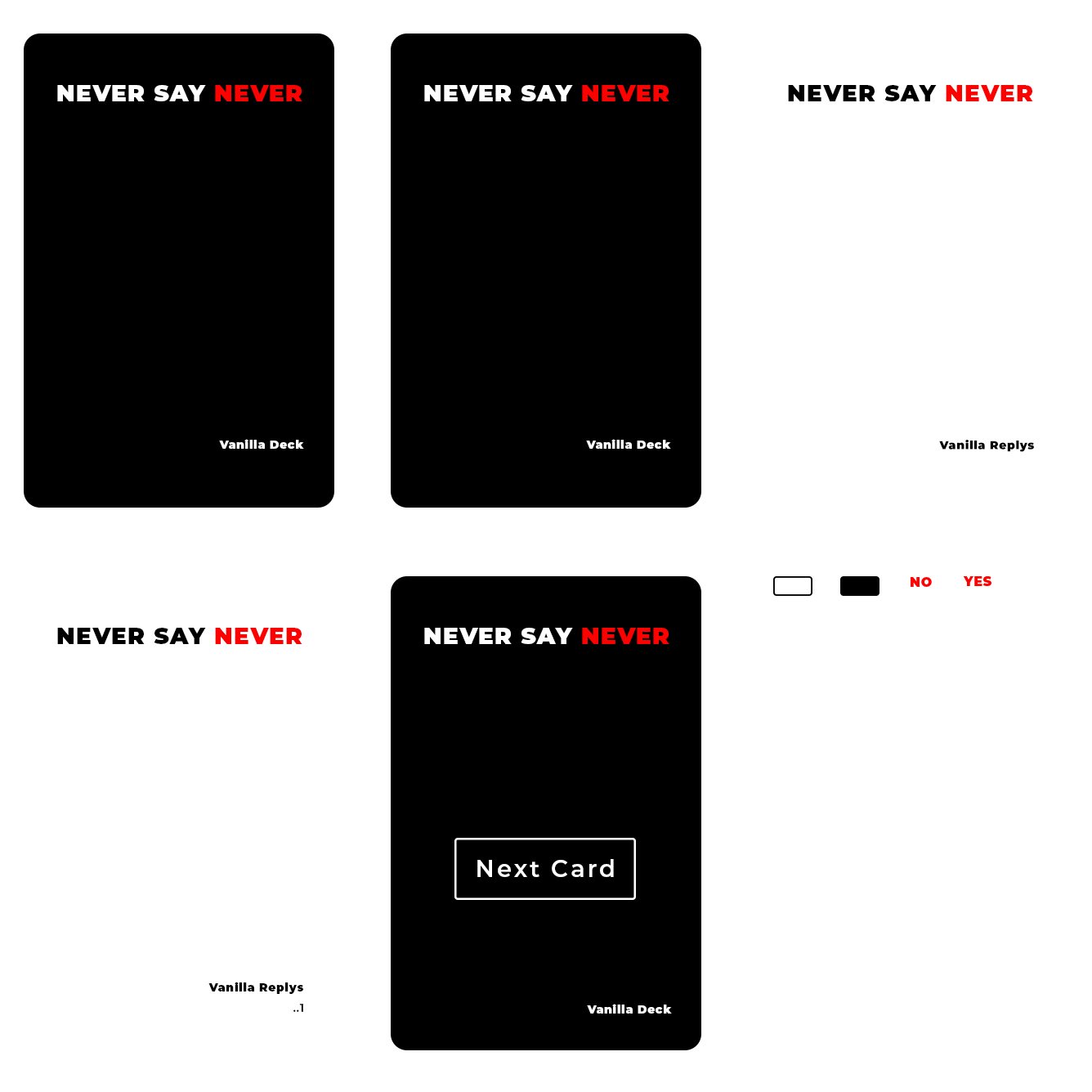
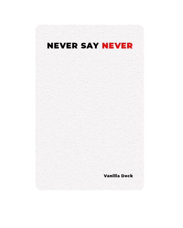
With the people and the game night in mind, I mapped how a host sets up a game and how a round plays out, card by card, then designed the cards themselves.
Takeaways
Where it landed
Never Never reached prototype before the team moved on, and the research and early design work shown here are what survived. As one of my first UX projects, it taught me a great deal about Unity and researching gameplay.