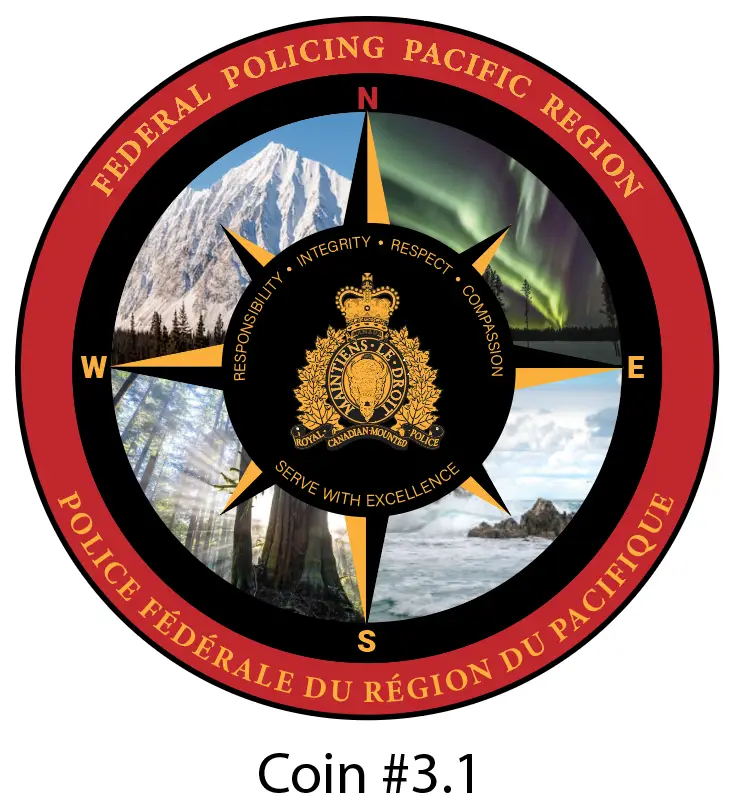
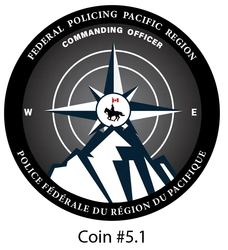
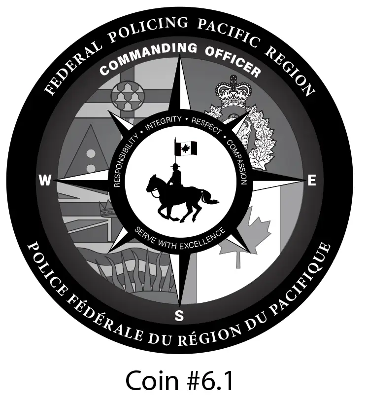
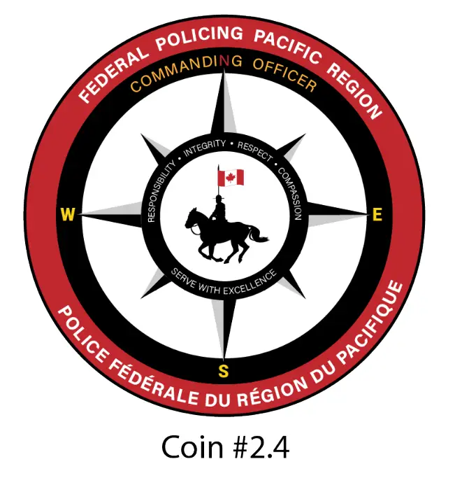
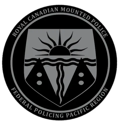
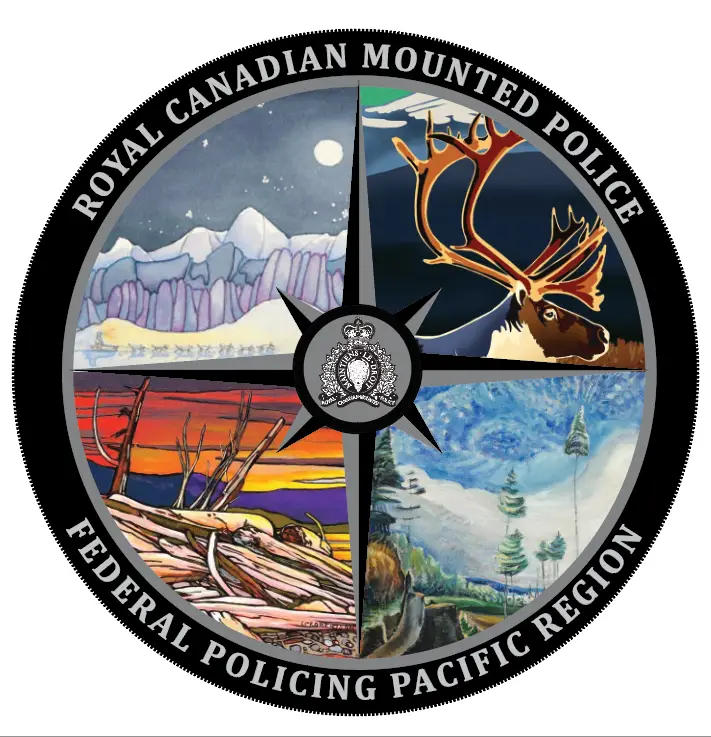
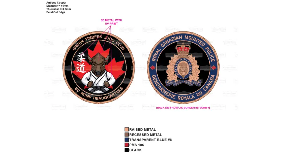
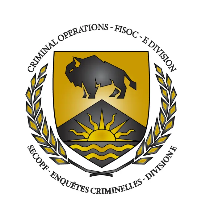
As a visual designer for law enforcement in E Division, I was asked to create a new logo for the province to be used on challenge coins, merchandise, and promotional materials. With an initial idea from a member, I started mocking up ideas.
Design Process and Deliverables
- Research and Analysis: Conducted in-depth research to understand the division’s history, values, and mission.
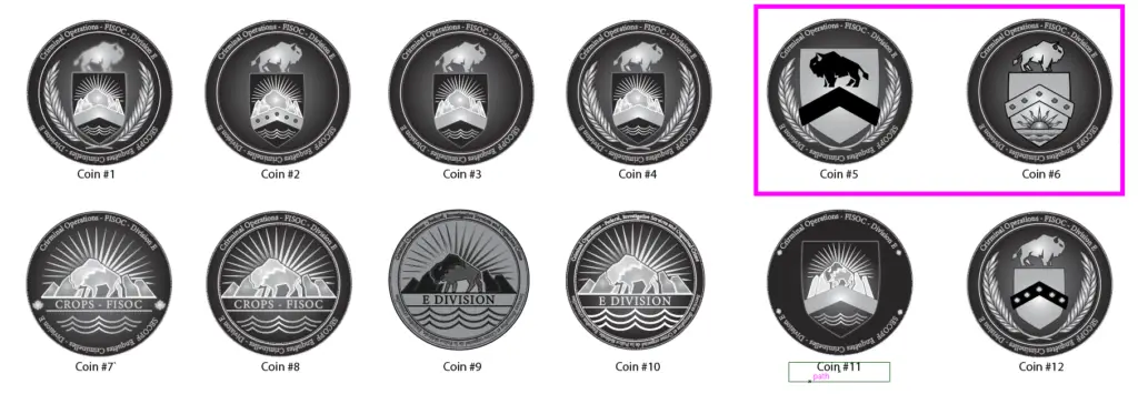
- Concept Development: Generated multiple concepts, based on the initial drawings, that reflected the division’s identity and ethos.
- Logo Refinement: Iteratively refined the selected logo design based on feedback and client preferences.
Key Deliverables:
- Logo Design: A distinctive and memorable logo that represented the division’s strength, integrity, and commitment to justice.
- Merchendise Production: Adjusted concept for various merchendise options such as a challenge coin, mug, and lanyard.
Impact and Recognition
The newly designed logo was unveiled in 2024 and received widespread acclaim amungst the law enforcement community. The crest has since evolved into the general logo for one of the provincial branchs.
By creating a visually compelling and meaningful logo, I contributed to the division’s brand identity and helped to strengthen its presence both internally and externally.
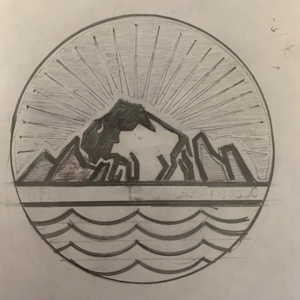


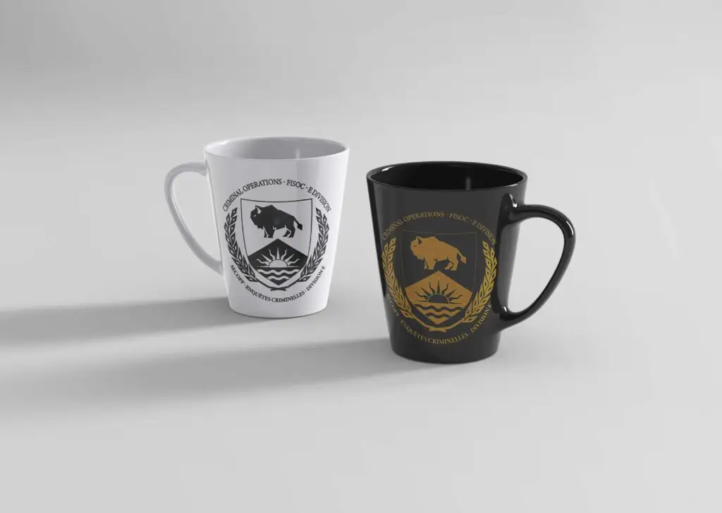
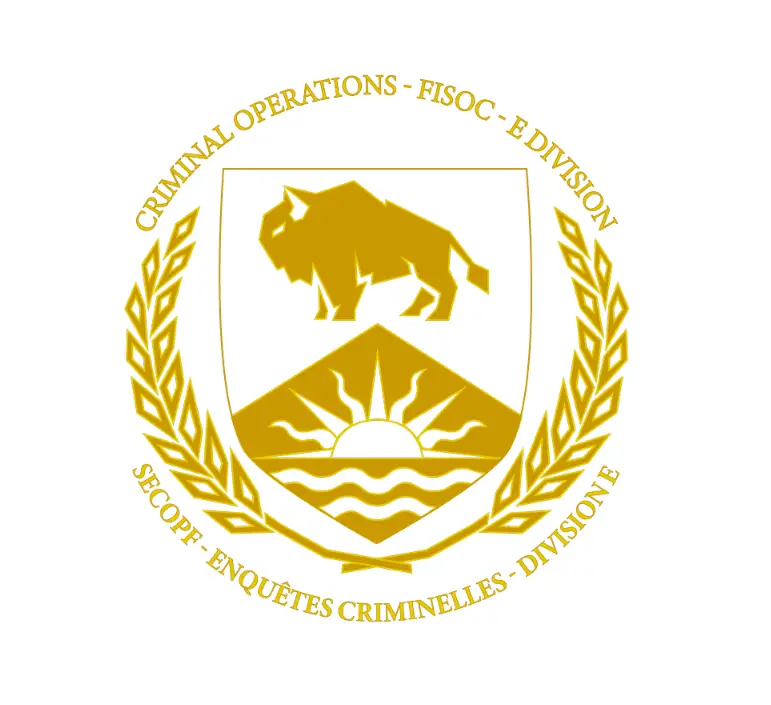
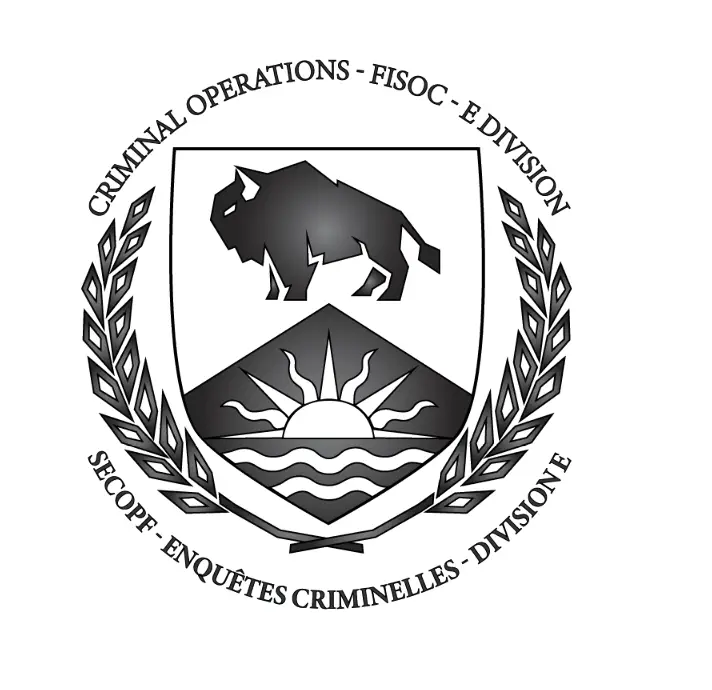
Design Iterations


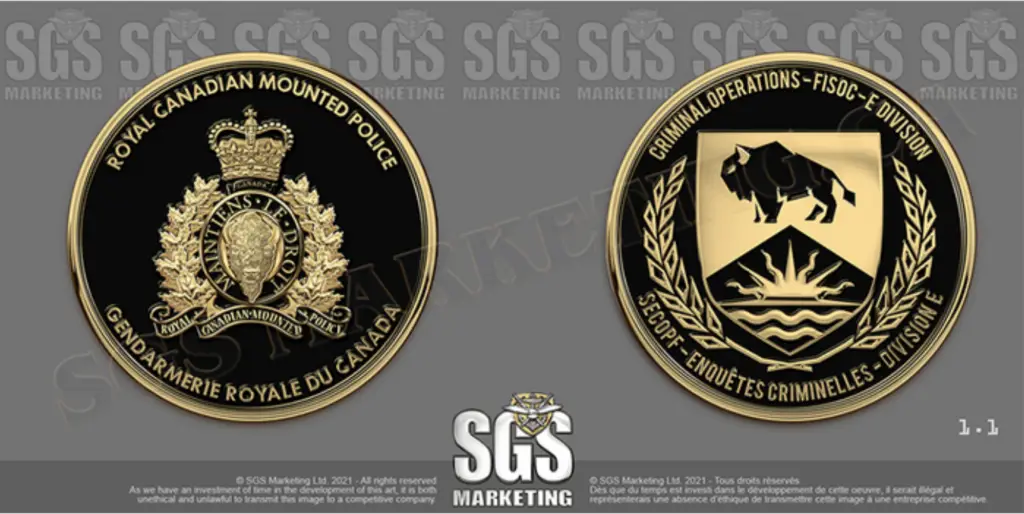
Other Law Enforcement Coin Designs
