Case Study: Brew Crew
Connecting Friends & Breweries
A mobile app to connect good friends with good beer for good times.
The Project
Organization: Howl Studio
My role: User Experience Researcher, Product Designer, Product Owner
Team: Product Manager, 1 Developer, and Product Design and Research
Timeline: June 2020 – January 2021
Status: Proof Of Concept Pitch
Overview
The Brew Crew app was a mobile application designed to enhance the experience of discovering and exploring local craft breweries. Despite initial positive user feedback, the project faced challenges due to evolving market conditions and the emergence of competing apps. This case study explores the key challenges, lessons learned, and potential future directions for the app.
Problem Statement
People need a better way to discover what a brewery has to offer in terms of both products and procedure in order to confidently make reservations during a pandemic.
The 6-month scope for this project was generous and allowed me to explore various research methods. I utilized these key methods and tools in my design process:
- Topic Analysis
- User Research
- Prototyping & Testing
- What Our Team Learned
Topic Analysis
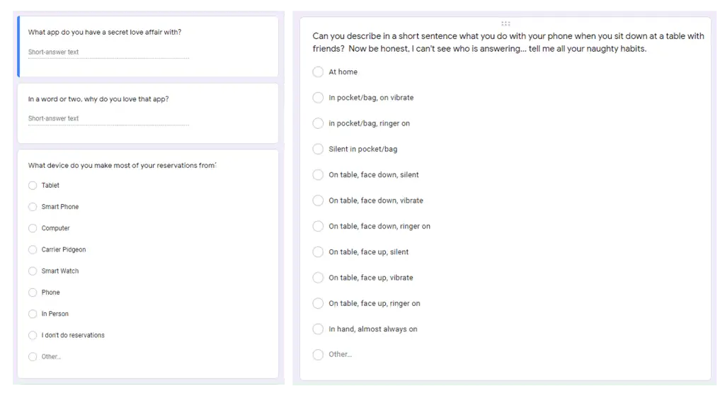
Through a series of qualitative interviews and quantitative survey questions, I was able to gather data on the subject of beer consumption in the GVRD.
Qualitative Data: 3 interviews with local target market
Quantitative Data: Online survey with 34 participants
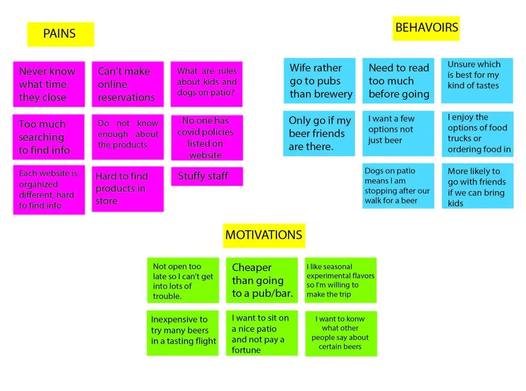
Affinity Diagram
Qualitative and quantitative data was collected from the 3 sit-down interviews and 34 participants who answered the online survey. All of the data points were recrded on sticky notes and grouped into common pain points, behaviors, and motivations.
Meet The User
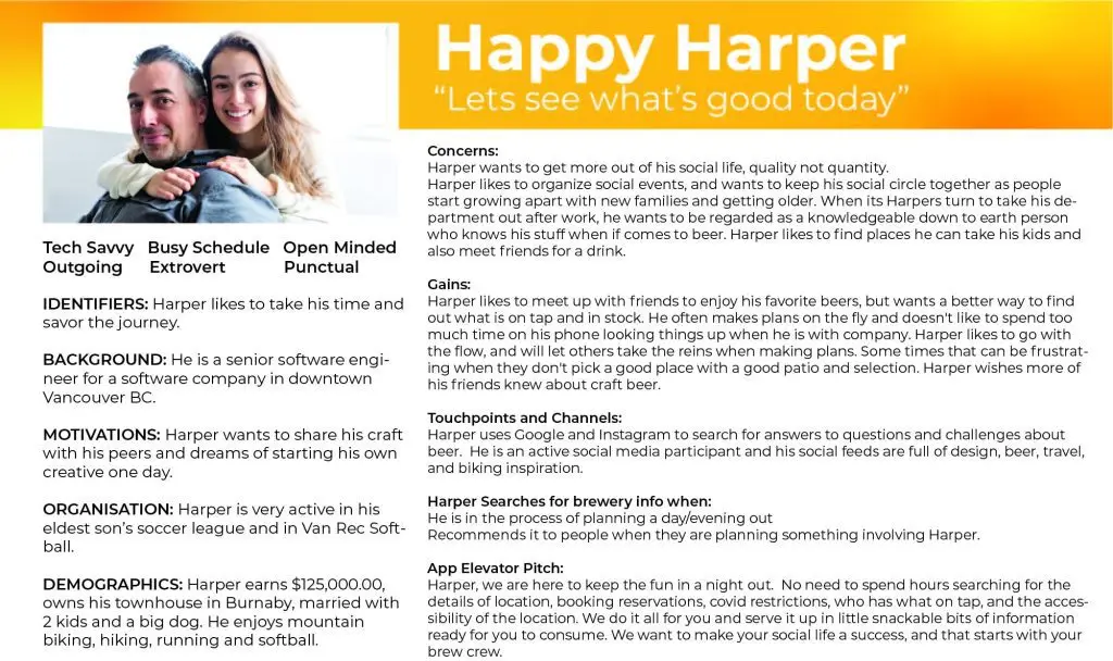
Primary User Persona Findings:
Based on my data, most users are looking for:
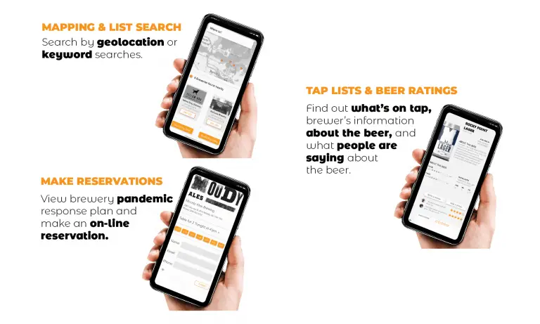
- Easy brewery discovery: A simple way to find breweries near them using maps or keyword search.
- Taplist information: Detailed information about what’s on tap at each brewery, including customer reviews.
- COVID protocols: Clear information about brewery policies and reservation options.
Persona Hypothesis:
By providing a user-friendly app that allows users to easily discover local breweries, compare beer offerings, and connect with other beer enthusiasts, we can meet the needs of Alex and other users in the target demographic.
Demographics:
- Age (40-50): Clean layouts, legible fonts, and subtle animations.
- Income (90,000-150,000): Ensure the design conveys a sense of quality and sophistication, reflecting the target demographic’s higher income level.
- Education (Graduate or higher): Interface that is intuitive and easy to navigate, catering to a well-educated user base.
- Location (GVRD Vancouver): Incorporating local references or design elements that resonate with the Vancouver region.
- Lifestyle (Active, social, tech-savvy): Design an app that is visually appealing, easy to use on mobile devices, and supports social features for connecting with friends.
User Goals:
- Discover new craft breweries in the local area: The persona enjoys exploring local businesses and finding hidden gems.
- Easily compare beer offerings: Wants to quickly and easily compare the beers available at different breweries.
- Connect with other beer enthusiasts: Enjoys socializing and meeting new people who share their passion for craft beer.
- Stay informed about upcoming events and specials: Awareness of beer festivals, happy hours, and other events related to the local craft beer scene.
- Support local businesses: Interested in supporting local businesses and contributing to the community.
Moodboard
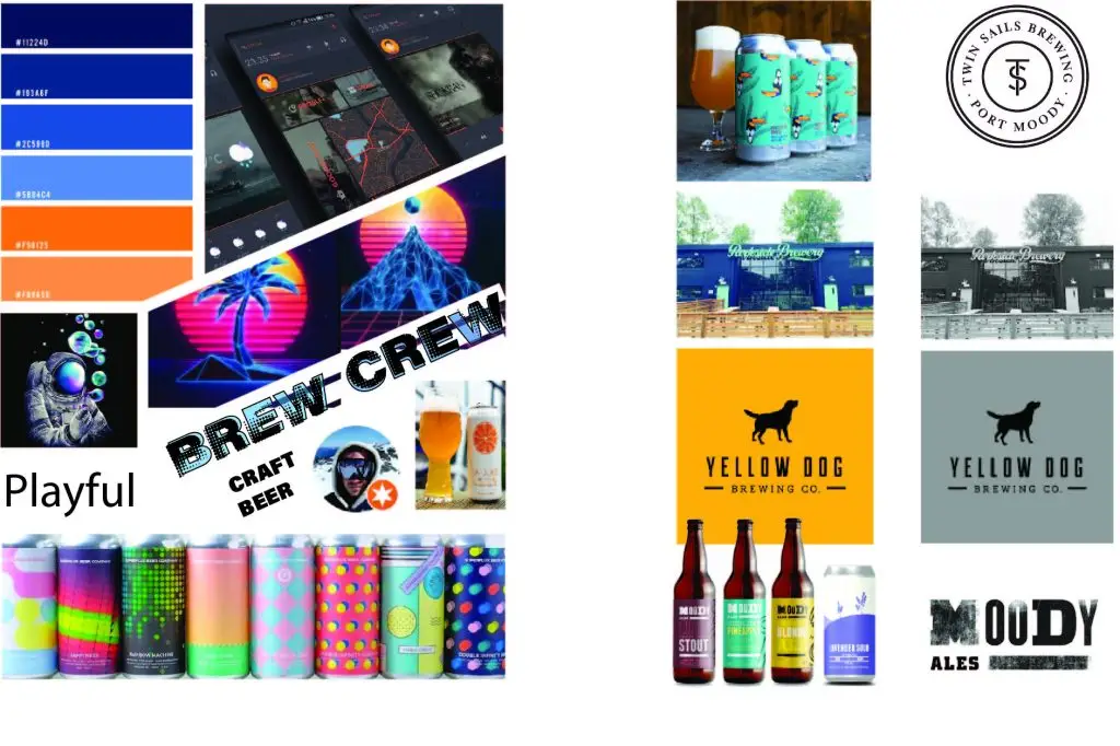
Inspired by the user persona and needs statement, I developed an initial moodboard that reflected the light-hearted and fun spirit of craft beer. The vibrant colors and lines were chosen to evoke a sense of carefree enjoyment. However, after testing with a focus group, I discovered that the bright color palette compromised readability.
To address this issue, I refined the moodboard for the next iteration, opting for a more conservative color palette with higher contrast for text and imagery. This adjustment ensured that the visual elements were both visually appealing and easy to read, enhancing the overall user experience.
Brand Identity
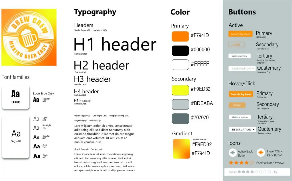
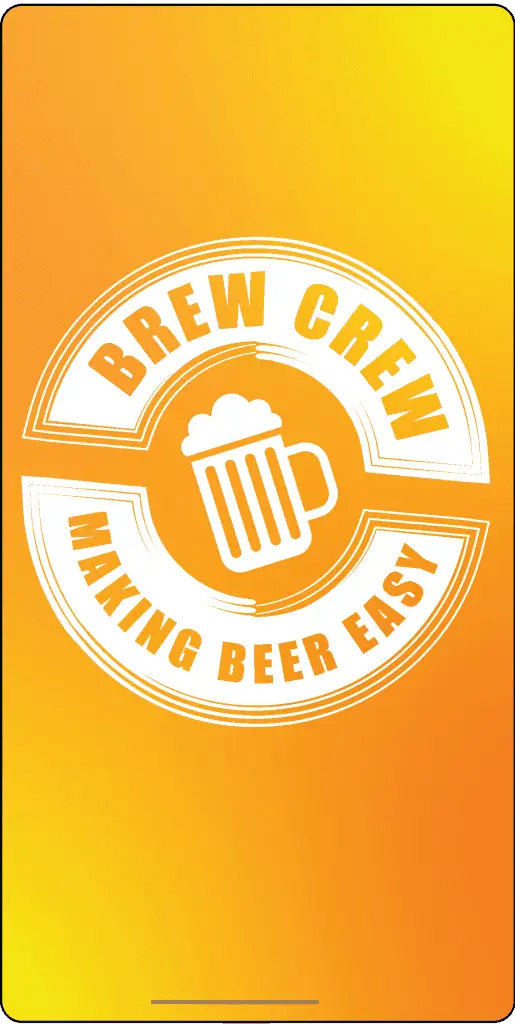
In developing the brand identity, qualitative psychographic and demographic data played a pivotal role in shaping the color scheme. The vibrant yellows and oranges emerged as prominent choices, resonating with the essence of beer itself. The high contrast between these hues and white iconography not only ensured readability but also evoked a sense of dynamism, mirroring the pouring motion of beer.
To maintain visual balance, careful consideration was given to the distribution of color across the brand elements. Most mapping and brewery branding were deliberately decolorized, allowing the chosen palette to stand out prominently. With the color scheme established, I proceeded to create a cohesive style system that reflected the brand’s identity. Additionally, prioritizing legible typography was crucial, especially for a mobile app where showcasing the intricate can art was paramount.
Visual Elements
- Vibrant hues: The use of yellow and orange evoked the energy and excitement associated with craft beer.
- High contrast: The contrasting colors ensured readability and visual interest, making the interface stand out.
- Deliberate decolorization: The use of a limited color palette allowed the primary colors to stand out, creating a strong visual focus.
- Prioritized typography: Legible fonts were chosen to ensure easy readability, especially on mobile devices.
- Cohesive style system: The design elements were carefully integrated to create a consistent and recognizable brand identity.
- Intricate can art: The design highlighted the unique and visually appealing can art associated with craft breweries.
Prototyping & Testing
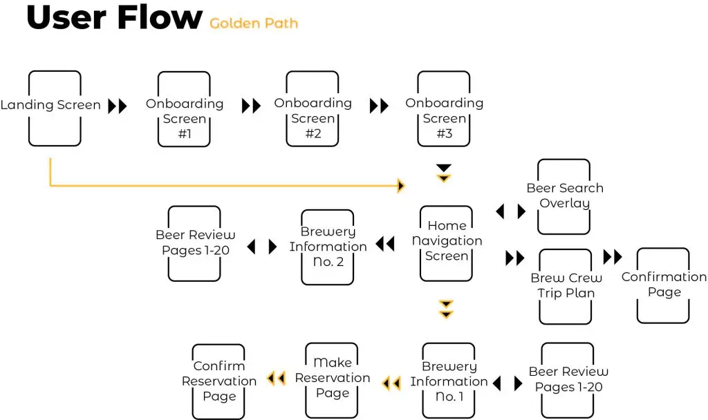
Simplified Information Architecture
Card sorting revealed these key user-defined categories:
- Primary Navigation: Search Near Me, Make A Plan, View Plans
- Secondary Navigation: Contacts, Polls, Search
- Tertiary Navigation (Hamburger Menu): Reservations, Messages, Chat
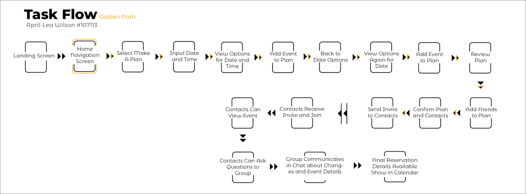
These findings will inform the information architecture and task flow of the project, ensuring that the app’s features are organized in a way that aligns with user expectations.
Usability Testing & Feedback
User Testing Participants:
- Demographic: 5 participants aged 30-45, residing in Vancouver, BC.
- Background: Craft beer enthusiasts with varying levels of experience.
Testing Scenarios:
Scenario 1: Brewery Discovery
- Task: Find a local brewery with a wide selection of IPAs.
- Findings: Users successfully used the map and search functionality to locate breweries. Some users expressed a desire for additional filters (e.g., food options, outdoor seating).
Scenario 2: Beer Information
- Task: Browse the beer list at a specific brewery, select a beer, and read reviews.
- Findings: Users found the beer list easy to navigate and appreciated the detailed information provided. Some suggested adding a “Save Favorites” feature.
Scenario 3: Making a Reservation
- Task: Find a brewery with outdoor seating and make a reservation.
- Findings: Users successfully found breweries with outdoor seating and accessed reservation information. Some suggested adding a feature to view real-time availability.
Overall Findings:
Positive Feedback: Users generally found the app easy to use and informative.
Areas for Improvement:
- Consider adding more filters for brewery search (e.g., food options, outdoor seating).
- Implement a “Save Favorites” feature for frequently visited breweries.
- Explore adding real-time availability for reservations.
Key Takeaways
Project Overview
The Brew Crew app was developed during the COVID-19 pandemic to address the changing dining habits and social interactions of beer enthusiasts. While the initial design iterations were successful, the project’s scope and necessity shifted as restrictions eased and alternative solutions emerged.
Key Insights
- Adaptability to Changing Circumstances: The project highlighted the importance of adaptability in product development, as user needs and market conditions can evolve rapidly.
- Value of User Research: The insights gained from user testing were crucial in refining the app’s design and ensuring a positive user experience.
- Competitive Landscape: The emergence of alternative solutions, such as the Ale Trail app, underscores the importance of staying informed about market trends and competitor offerings.
- Foundation for Future Projects: The design methodologies and learnings from this project can be applied to future endeavors, even if the Brew Crew app itself is not pursued further.
Future Considerations
- Re-evaluating the project: As the landscape continues to evolve, it may be worthwhile to revisit the Brew Crew concept and assess its potential to meet current user needs.
- Exploring new opportunities: The skills and experience gained from this project can be applied to other digital solutions, even if they are not directly related to the craft beer industry.
Overall, the Brew Crew project provided valuable insights into user-centered design, product development, and market adaptability. These learnings can serve as a foundation for future projects and contribute to the development of innovative digital solutions.

