Case Study: INcrowd
A Social Planning App
An app to connect, communicate and improve planning.
Overview
INcrowd is a native app for groups of people that want a cooperative way to make and share plans and decisions for a night out. It borrows the connectivity and playfulness of Snapchat, the data and reservation abilities of Opentable, and the group polling capabilities of Doodle; combined to create an app that will connect people for an evening of fun, in safe and organized manor.
The Project
Organization: Howl Studio
My role: User Experience Researcher, Product Designer, Product Owner
Team: Product Manager, 1 Developer, and Product Design and Research
Timeline: November 2020 – January 2021
Status: Proof Of Concept Pitch
Goals & User Problems
The app helps groups of friends connect, communicate, and plan activities. The 6 week scope for this project posed some real constraints. For this short time frame I utilised these key methods and tools in my design process:
- Topic Analysis
- User Research
- Prototyping & Testing
- What Our Team Learned
Project Kickoff
Due to the COVID-19 pandemic, in-person interviews were challenging. We opted for an online survey to gather initial qualitative data. While social media channels introduced some bias in the respondent group, we intentionally focused on designing an app that would appeal to people similar to myself.
Where to Start:
- 2 Online surveys with 90 participants total
- Consolidate demographic findings
- 1:1 Interviews with 6 target users
- Better understand user motivations and behaviors
My Process
Empathize
Research users and their needs and behaviors
Define
Clarify and state users needs and problems
Ideate
Think outside of the box to generate many solutions
Prototype
Visualize the best solutions to solve the users problems
Test
Test with real users and iterate on the best ideas
Meet The User
Primary User Persona Findings:
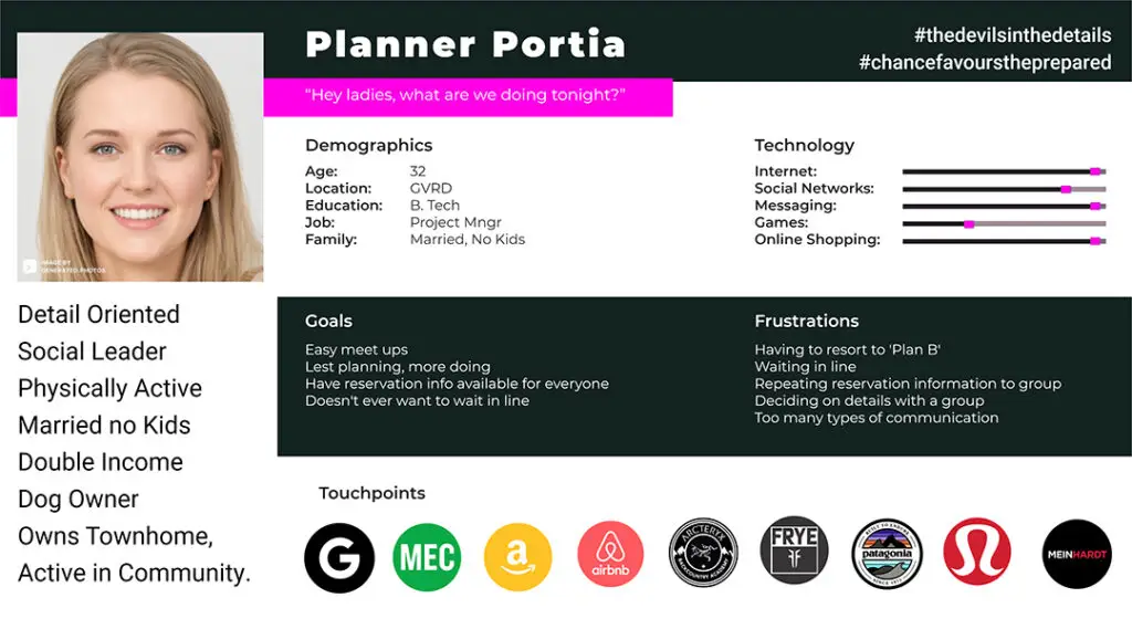
I synthesized data to create a primary user persona: Planner Portia. This persona, representing our target demographics, guided my design decisions for the INcrowd app, ensuring it met user needs.
Demographics:
- Age: 30-41 years old
- Income: Average sole income > $75,000
- Education: Post-secondary designation
- Location: Greater Vancouver Regional District, British Columbia
- Lifestyle: Active, social, tech-savvy, and enjoys planning events
Goals:
- Efficiently plan and organize social events with friends, family, and coworkers.
- Discover new and exciting venues and activities.
- Connect with like-minded individuals and build social connections.
Pain Points:
- Difficulty coordinating schedules and finding suitable venues.
- Inefficient planning tools and communication methods.
- Lack of personalized recommendations and suggestions.
Motivations:
- Enjoys the social aspects of planning events.
- Values control and the ability to customize plans.
- Seeks personalized recommendations and suggestions.
Persona Hypothesis:
social planning app that streamlines the event planning process, provides personalized recommendations, and facilitates seamless communication will significantly improve the social experiences of millennial social architects. By addressing their pain points and motivations, this app will become an essential tool for organizing and enjoying social events.
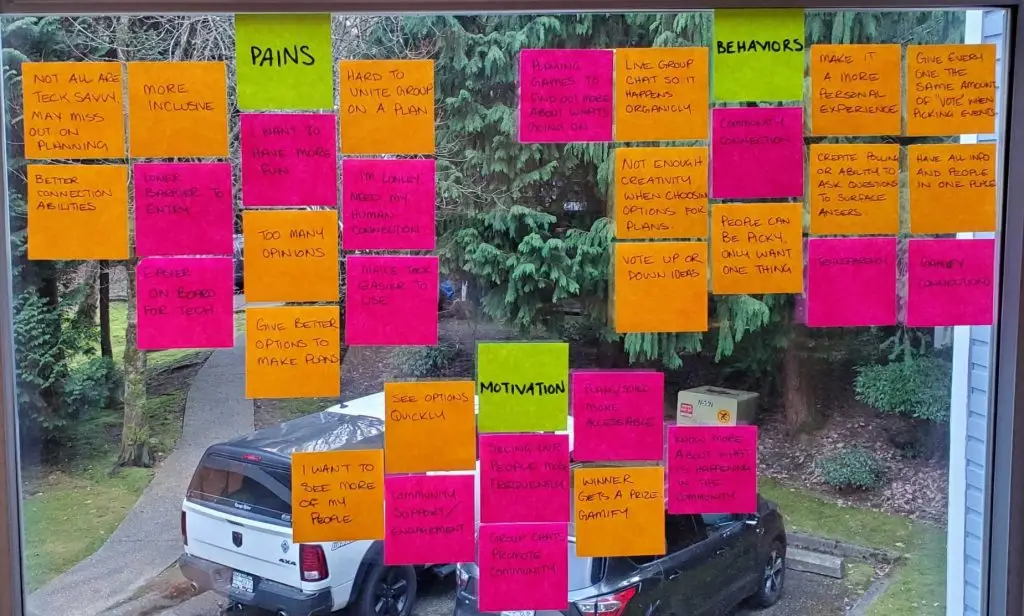
Competitive Analysis & Affinity mapping
By analyzing existing planning apps, I identified key user pain points and compared their feature sets. This analysis revealed a market gap for an app that could combine the best aspects of these tools, while also establishing a new standard for essential features and ease of use.
Key Competitor Gaps:
- Lack of Integrated Features: No existing apps offer a seamless combination of chat, search, and reservation functionalities.
- User Frustration: Users experience inconvenience and inefficiency when switching between multiple platforms for search and communication.
- Limited Merchant Adoption: Reservation features are not widely utilized by merchants due to associated costs.
User Needs:
- Simplified Experience: Users desire apps with a lower barrier to entry and a more intuitive interface.
- Enhanced Connectivity: There is a need for platforms that facilitate easier connections between individuals and businesses.
- Streamlined Planning: Users seek more efficient and integrated tools for planning events.
- Community Engagement: Access to local events and opportunities for community involvement is a priority.
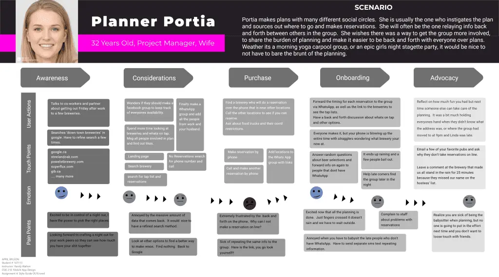
What We Learn From Portia’s User Journey
By understanding the persona’s goals, motivations, and pain points, we can create a realistic scenario that reflects their experiences. This user journey helps us visualize how the persona might interact with our product or service, allowing us to identify key touchpoints, challenges, and opportunities for improvement.
The User Journey Informs the Needs Statement
By observing the persona’s actions, emotions, and challenges throughout the journey, we can uncover the specific needs that our product or service must address. This helps us prioritize features, design decisions, and overall product strategy to ensure that it aligns with the user’s goals and expectations.
Refining A Needs Statement
Our data indicates that our target audience is seeking a platform that:
- Streamlines group planning: Offers intuitive tools for coordinating schedules, suggesting activities, and making reservations.
- Provides local event discovery: Curates personalized recommendations for events, venues, and activities in the user’s city.
- Enhances connectivity: Features real-time messaging, location sharing, and group chat to keep everyone informed and connected during outings.
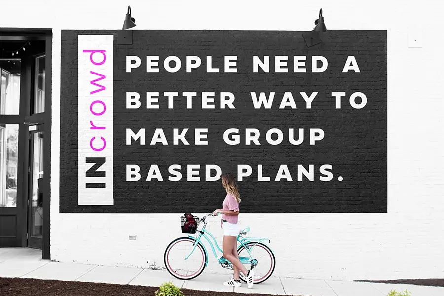
“People need a better way to make group based plans. There is a need for better connectivity during the planning portion, as well as an ability to stay connected with all the information through out the event.”
Prototyping & Testing
Simplified Information Architecture
Card sorting revealed these key user-defined categories:
- Primary Navigation: Search Near Me, Make A Plan, View Plans
- Secondary Navigation: Contacts, Polls, Search
- Tertiary Navigation (Hamburger Menu): Reservations, Messages, Chat
These findings will inform the information architecture and task flow of the project, ensuring that the app’s features are organized in a way that aligns with user expectations.
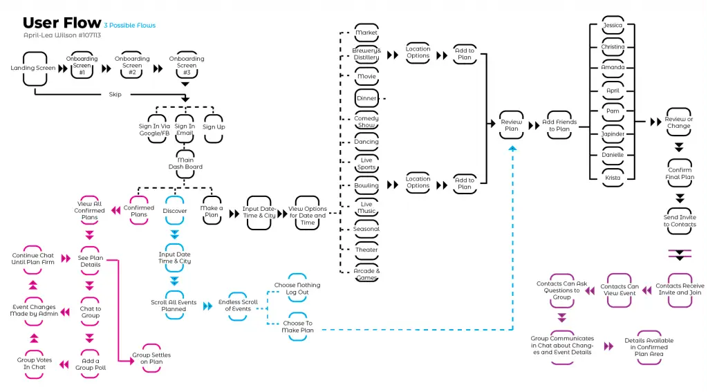
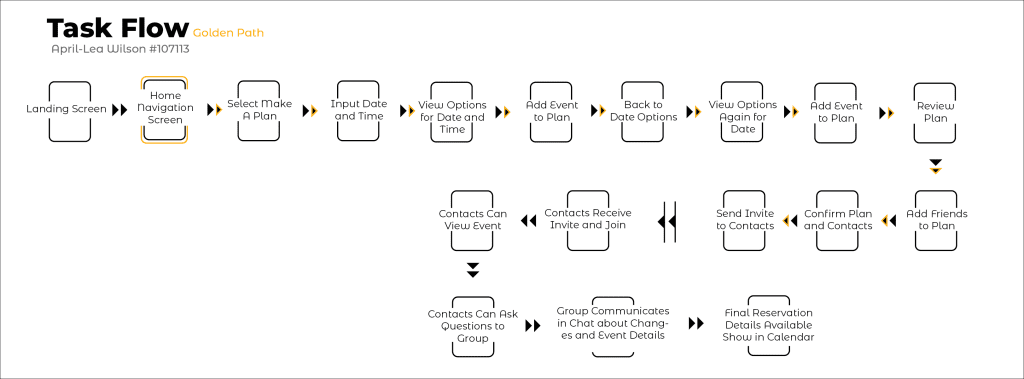
Visualizing the Golden Path
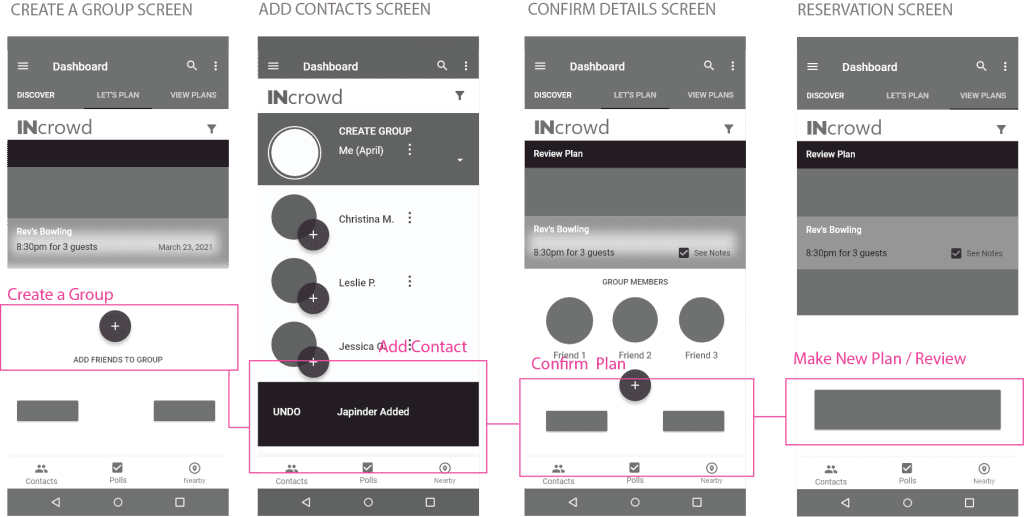
This task flow shows the user’s linear perspective along the golden path of the app. This path shows the progress or sequence of choices and key high-level screens through the design.
Refining Features
Unclear Buttons
Users expressed confusion about the swiping mechanism for adding contacts.
branding Feedback
The app's name "OUTcrowd" and use of pink unintentionally implied LGBTQ connotations.
colour Contrast
Button text lacked sufficient contrast in low-light conditions, making it difficult to read.
Inactive Buttons
Users expected the polling button to be functional and were confused when it was inactive.
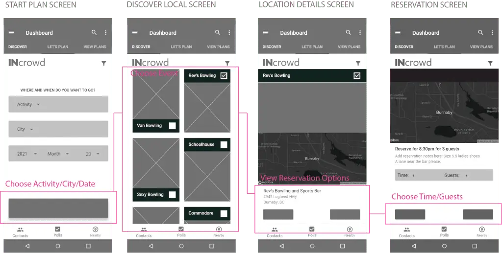
Discover Events Nearby
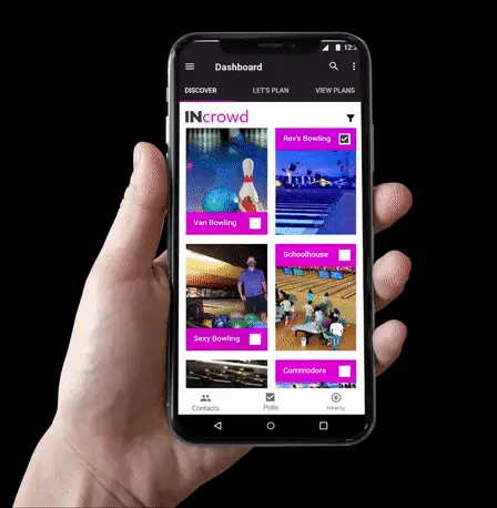
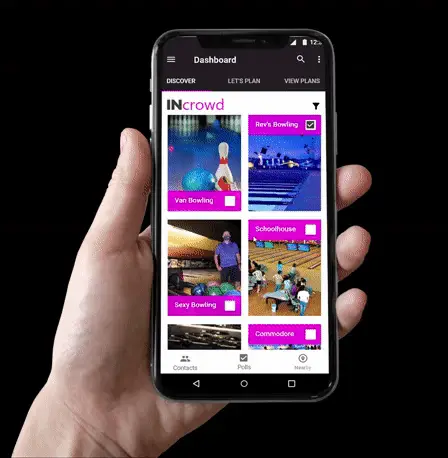
The app’s top dashboard includes search, filter, and menu options. Below, three primary tabs (DISCOVER, LET’S PLAN, VIEW PLANS) organize the app’s core features for finding, planning, and viewing events.
Once a location is selected, users can:
- Create a reservation: Add the selected location to their plan.
- Add contacts: Invite friends to join the group reservation.
- Chat: Engage in group discussions to plan and coordinate.
- Use polling: Decide on activities or venues using the app’s polling feature.
Prototype Evolution
Uncovering Confusion and making Changes
Key Information:
- Number of Testers: 4
- Number of Tasks: 3
- Number of Iterations: 2
Testing Tasks:
- Set a profile photo: Assess user ease in navigating to profile settings and uploading an image.
- Find the Contacts list: Evaluate user ability to locate and access the contact list.
- Create a bowling plan: Test user ability to create a new plan, select a venue, invite contacts, and set a date and time.
User Persona: Portia
Portia is a socially active individual seeking to organize high-quality events for her friends and colleagues. She values efficiency and control in planning but wants to avoid appearing overly pushy.
Initial Testing Feedback:
- Task Completion: All testers successfully completed the tasks.
- Clarity Issues: Specific areas of the interface required clarification.
- UI Color: Feedback was received regarding color choices.
- Contact Button Functionality: Users expressed confusion about the swiping mechanism for adding contacts.
- Polling Button: Users expected the polling button to be functional and were confused when it was inactive.
- Branding: The app’s name “OUTcrowd” and use of pink unintentionally implied LGBTQ connotations.
Overall, the initial testing provided valuable insights for improving the user experience and addressing design weakness.
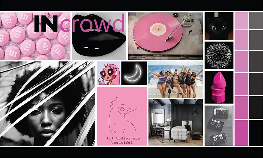
Empowered feminine minimalism
Core Values:
- Community: Fostering a sense of belonging and connection among users.
- Efficiency: Streamlining the event planning process and saving users time.
- Inclusivity: Welcoming users from diverse backgrounds and interests.
- Reliability: Providing a trustworthy and dependable platform for planning events.
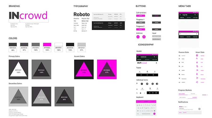
Visual Elements:
- Color Palette: Vibrant and energetic colors that evoke a sense of fun and excitement.
- Typography: Modern and legible fonts that are easy to read and visually appealing.
- Imagery: Photos and illustrations that depict people enjoying social events and activities.
- Logo: A simple yet memorable logo that reflects the brand’s values and personality.
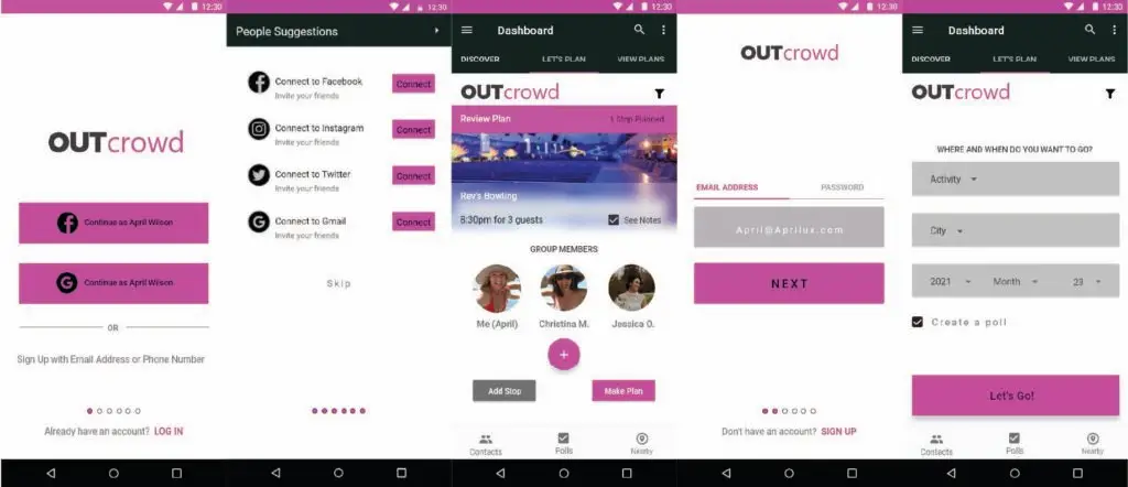
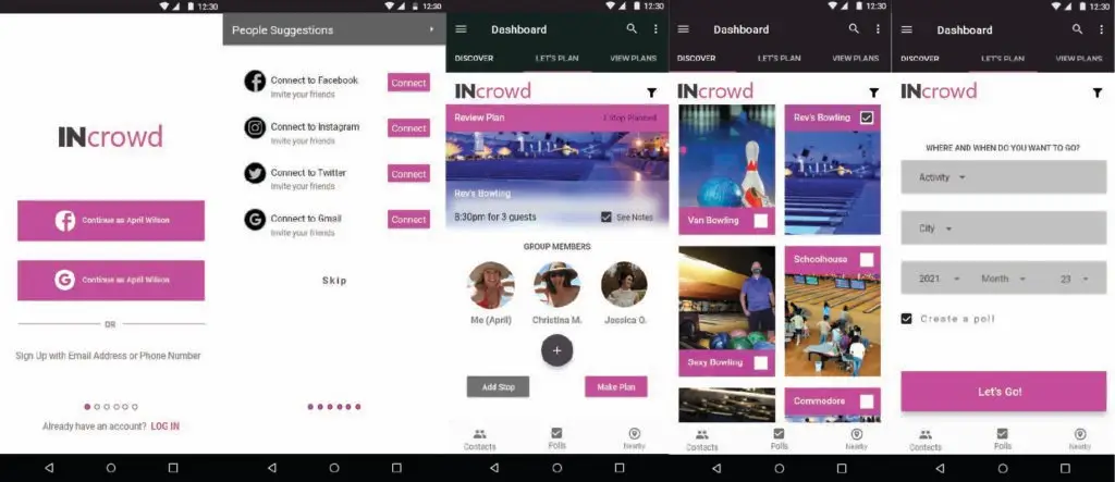
Main Screens On Golden path
Key Changes Between Iterations:
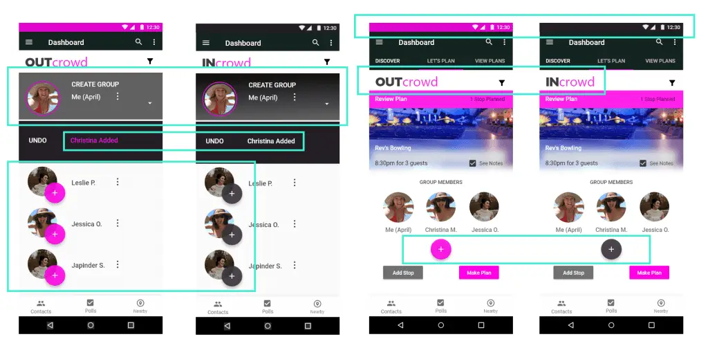
- Branding: Updated the app’s name.
- Header Color: Changed the header color from pink to black.
- Text Color: Modified text color from black to white on pink for improved readability.
- Background: Replaced solid gray with a gradient background to enhance visual appeal.
- Button Color: Added pink buttons for clarity and consistency.
- Text Contrast: Adjusted text color to white on black for better readability on pink buttons.
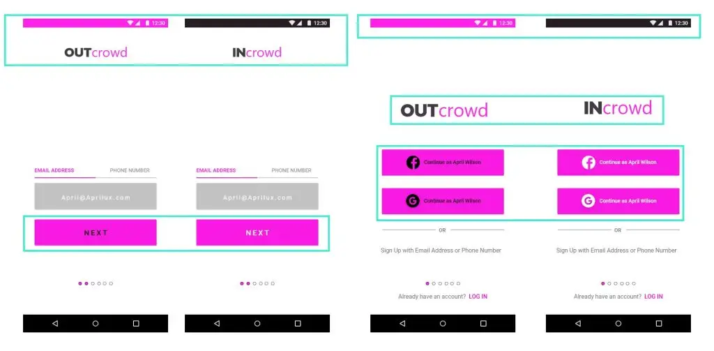
before & After Usability Testing
Key Changes Between Iterations:
- Color Palette:
- Changed header color from pink to black for better contrast.
- Adjusted text colors for improved readability (e.g., white on black).
- Modified pink elements within buttons to black for a clearer call to action.
- Branding:
- Replaced the “INcrowd” logo with “OUTcrowd” due to potential misassociations.
- Considered alternative branding strategies for future iterations, such as a complete rebranding or focusing on a specific market segment (e.g., LGBTQ community).
- Micro Interactions:
- Updated “add contact” buttons to use a more intuitive and visually appealing design.
Key Takeaways
These experiences highlight the importance of user-centric design, iterative development, and open-mindedness. Further user testing is essential to validate the app’s concept and inform future iterations.
Early Feedback is Crucial:
- Iterative Design: Incorporating early feedback is essential for avoiding costly changes later in the development process.
- Open-Mindedness: Resisting the urge to impose personal preferences on design choices is crucial.
Wireframing is a Foundation:
- Prioritizing Wireframes: Spending adequate time on wireframing and user testing helps ensure a strong foundation for the final design.
- Flexibility: Maintaining a medium-fidelity stage allows for easier iterations based on feedback.
Pandemic Challenges:
- Bias Awareness: Recruiting testers without preconceived notions about the app is important.
- Observational Skills: Observing users without interference is a valuable skill for gathering authentic feedback.

