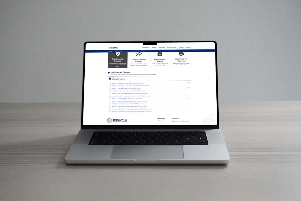
Case Study: DataSight
Tools To Increase Data Literacy
Designing the Tableau pilot program for provincial law enforcement.
The Vision
DataSight aims to boost data literacy within provincial law enforcement, enabling staff to confidently use data for reporting and decision-making. By offering self-paced learning, the tool empowers employees to stay current with data trends, enhancing accuracy and effectiveness in both field operations and headquarters, ultimately benefiting policing and communities.
The Project
Organization: Provincial and Federal Law Enforcement Agencies
My role: User Experience Researcher & Product Designer
Team: Product Manager, Data Engineer, Data Administrator, 2 Developers, and Product Design and Research
Timeline: May 2024 – Present
Status: MVP V2 Beta Release
Goals & User Problems
The primary goal of DataSight is to empower provincial law enforcement personnel with the skills and confidence to use data tools like Tableau. By providing a platform for self-directed learning, This initiative aims to enhance data literacy, foster accurate reporting, and improve decision-making across the organization.
User Problems
Lack of mentorship: Users don’t have access to colleagues who can guide them in learning tools like Tableau and Power BI.
Overly complex tutorials: Existing online tutorials are not beginner-friendly and fail to address the specific needs of law enforcement users.
Unfamiliar data contexts: Users struggle to understand how their organization’s specific datasets integrate with these tools, given their distinct requirements compared to public or corporate datasets.
Steep learning curve: Tools like Tableau and Power BI are perceived as difficult to master without tailored support.
User Goals
- To gain practical, hands-on experience with Tableau and Power BI for law enforcement data reporting.
- To understand how their organization’s specific datasets can be utilized effectively within these tools.
- To access simplified, tailored tutorials that allow for incremental learning without feeling overwhelmed.
- To feel confident in their ability to apply data visualization and reporting skills to their daily tasks.
Goal-Directed Design: Where to Start
Leverage 1:1 stakeholder insights: Use the qualitative data from stakeholder interviews to define high-priority user needs and pain points.
Tailor tutorials to organizational data: Create guided lessons that integrate specific law enforcement datasets, providing practical, relatable examples.
Simplify initial learning: Offer beginner-level tutorials that gradually introduce advanced features, easing the transition into more complex tasks.
Build mentorship opportunities: Integrate a peer-support or mentorship feature that allows users to ask questions or collaborate with experienced colleagues.
Proto-Personas
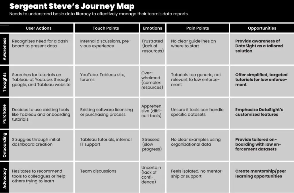
Sergeant Steve
Age: 45
Role: Supervisor overseeing investigations
Tech Comfort Level: Low
Learning Style: Reading and auditory
Goals: Needs to understand basic data literacy to effectively manage their team’s data reports.
Frustrations: Finds technical jargon intimidating and prefers step-by-step guides.
Journey: Sergeant Steve accesses a simplified data literacy course in DataSight, listens to a narrated guide, and follows written step-by-step instructions for interpreting key metrics.
Analyst Annie
Age: 31
Role: Data analyst for a provincial police force
Tech Comfort Level: High
Learning Style: Visual and auditory
Goals: Wants to refine their skills in data interpretation and presentation.
Frustrations: Prefers visual examples and interactive data charts but dislikes lengthy written content.
Journey: Analyst Annie accesses DataSight and chooses a course with interactive graphs and video explanations, learning how to better interpret and present crime trends.
The User Journey
Sergeant Steve's User Journey Insights:
- Provide awareness of DataSight as a tailored solution
- Offer simplified, targeted tutorials for law enforcement
- Emphasize DataSight’s customized features
- Provide tailored onboarding with law enforcement datasets
- Create mentorship/peer learning opportunities
Competitive Analysis & User Research
To inform our portal layout and design, we conducted a comprehensive analysis of data generated through research activities.
Analysis Methods:
- User Research: Conducted 1:1 interviews and surveys to gather insights into user preferences, behaviors, and pain points.
- Market Analysis: Analyzed 3 other vendors with various course delivery methods.
- Research more on the four learning styles: Visual, auditory, reading/writing, and kinesthetic.
- Graceful Degradation Design For Larger Work Screens: Designing for larger screens first, since the user is primarily in office and making smaller designs responsive.


How Different People Learn
In our research we discovered that people learn differently. Since I am designing for a provincial audience, it is important to consider all learning styles in the delivery of the DataSight content.
auditory
learning through listening
reading/writing
learning through reading and writing
kinesthetic
Learning through hands on experiencing
Visual
Learning through seeing
preparing the journey
Visualizing the Golden Path
To visualize the user flow and main path through the app, I created wireframes based on the user stories.
- Created low-fidelity wireframes: To visualize the user flow.
- Iteratively refined design: Ensured it met user needs and guided them smoothly.
- Defined ‘golden path’: The ideal user journey.
- Informed first release UX: Before moving to visual design.
Branding and Layout
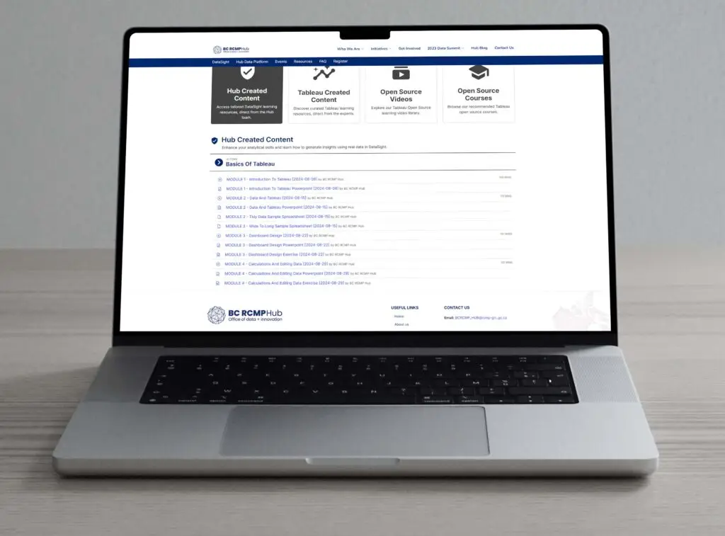
As DataSight is part of a larger website that houses multiple initiatives within the Hub ecosystem, the layout and branding must align with the Hub’s overall visual identity and user experience guidelines. It’s important that the platform maintains a cohesive look and feel while still differentiating itself as a unique tool for enhancing data literacy within law enforcement.
Here are key considerations for staying on brand:
- Consistent Design Language: DataSight’s interface follows the Hub’s established color palette, typography, and iconography to create a seamless user experience across all initiatives. This consistency helps users navigate between tools without feeling disoriented.
- Visual Hierarchy: While adhering to the Hub’s design standards, DataSight emphasizes the visual nature of its purpose. The use of charts, graphs, and data visualizations should take precedence in the layout, reflecting the platform’s goal of simplifying complex data.
- Logo and Name Alignment: The choice of the name “DataSight” reflects the platform’s focus on visualizing data clearly and effectively. i avoided names with conflicting associations, as was the case with “INsight,” which had narcotic use connotations with other services in Vancouver.
- Navigation and UX: DataSight integrates into the Hub’s navigation structure smoothly, ensuring users can move between platforms without confusion. Any unique aspects of DataSight, such as self-paced learning modules, fit within the larger ecosystem’s flow.
By ensuring that DataSight stays on brand and follows the visual and structural guidelines of the Hub, the platform can stand out while contributing to a unified, professional identity across all initiatives.
Focus group findings
Given the tight timeline, we conducted four focus groups to gather insights and refine the platform.
- Online sessions: 20+ participants led by one of our team’s data scientists, who walked users through a tutorial
- Internal Content Generation: All 4 sessions were recorded, including Q&A and posted in the curated content section for future use.
- Data Collected: We onboarded users and they filled out a questionnaire to share their needs around data, learning design and comfort level.
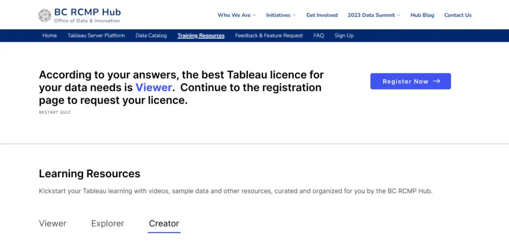
Key Findings and Insights:
- User behaviour: make changes to micro copy on buttons to avoid confusion
- Pain points: Able to address specific data issues in curated live sessions and help users sign up for the correct licence.
- Learning goals: Users prefered online delivery to in person.
While the parent site is built on SharePoint, which limits our analytics capabilities, we were able to track user interactions by designing the screens and pages as stand-alone elements. This allowed us to better understand how users engaged with the content and informed our decisions on how to structure the platform for optimal learning outcomes.
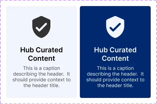
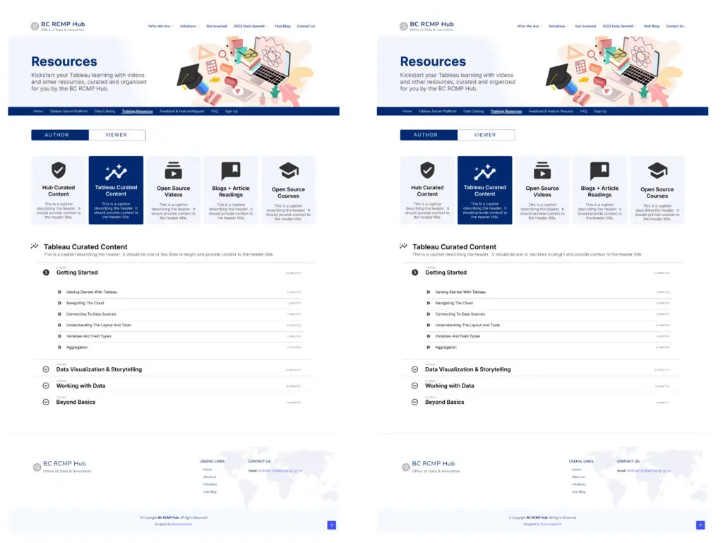
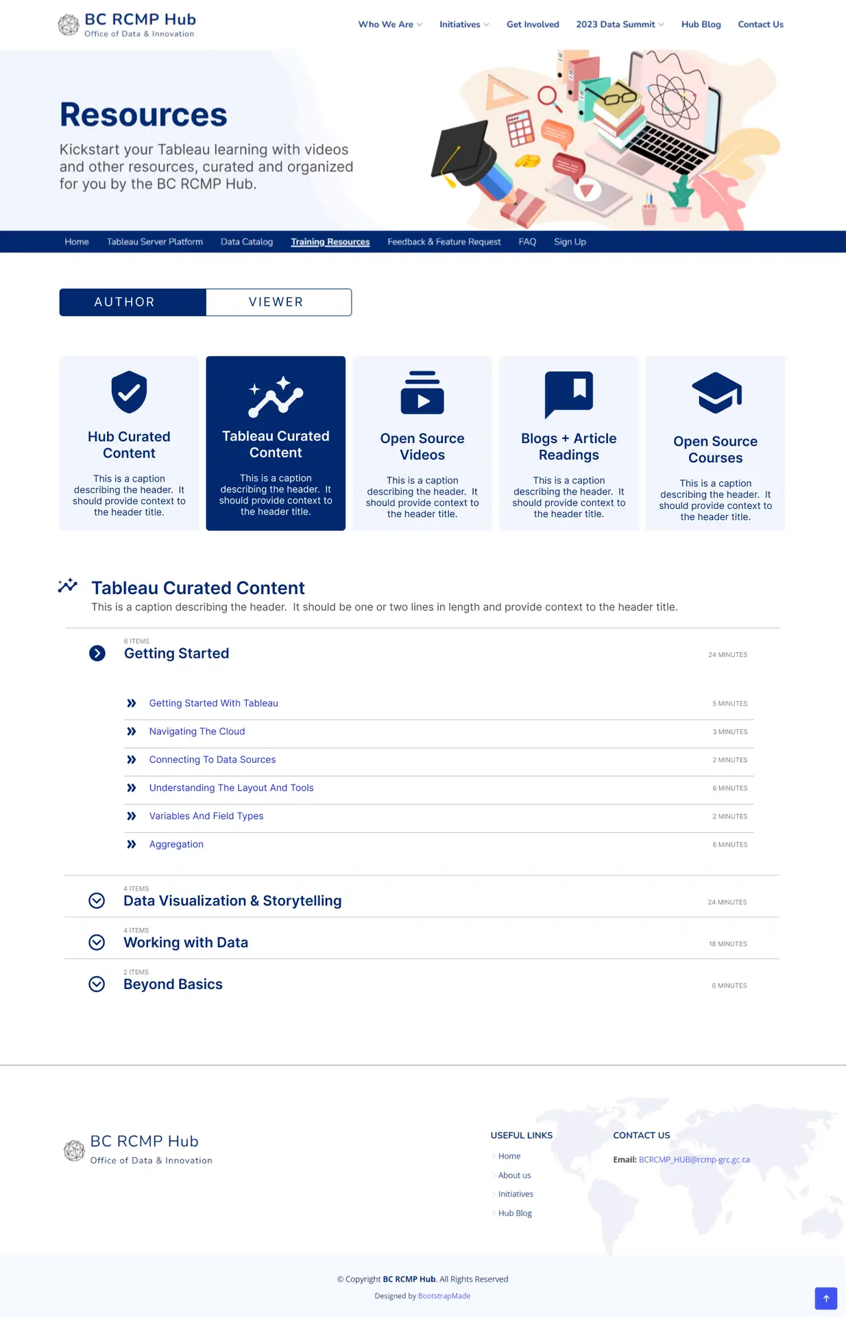
Adjusting Colours
Adjusting Brand Colours for Better Ui Definition
Initially, the design followed the established branding colors, with blue dominating the navigation bar and content tiles. However, this led to issues with visual blending and lack of clarity.
Key adjustments were made to address this:
- Problem: On scroll, the header bar and content tiles blended together, making navigation unclear.
- Short-term Fix: Changed the color of the tiles to create a clearer distinction between the navigation bar and the content.
- Long-term Plan: A broader update to the site’s color palette is planned for the next phase of the branding journey.
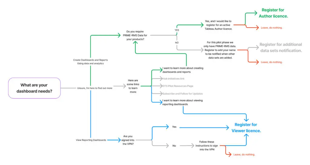
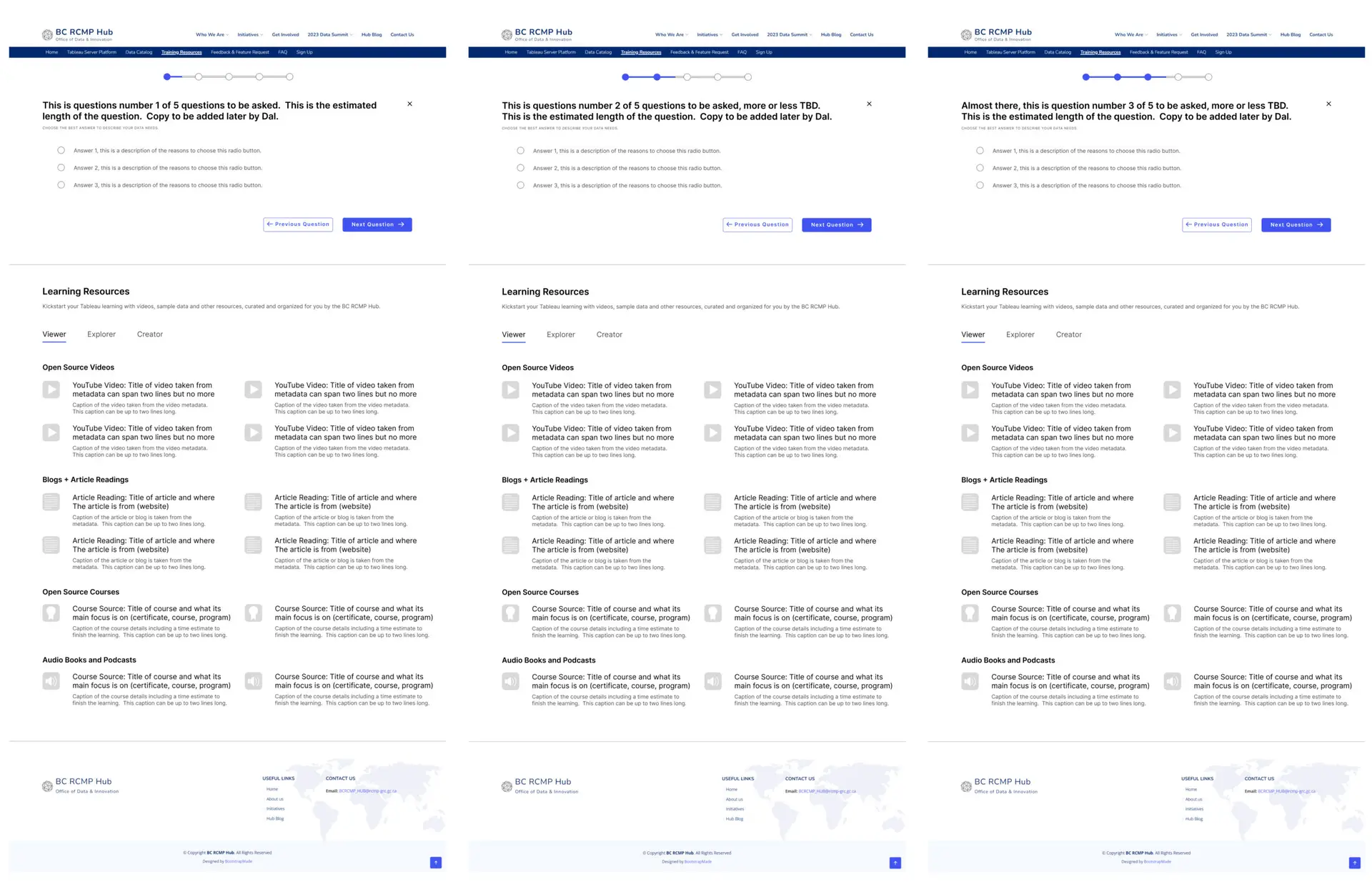
Creating a Decision Tree Questionnaire for Focus Group Participation
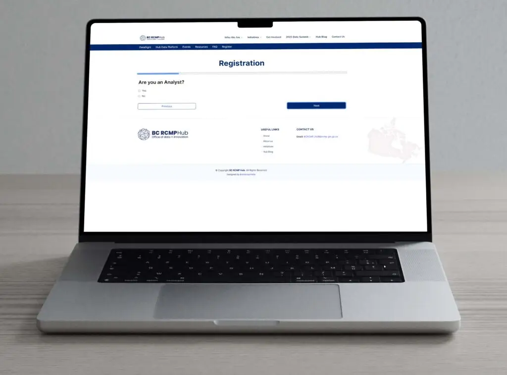
To streamline the recruitment of focus group participants, we designed a decision tree questionnaire using SharePoint’s form widget. This form guided users through a tailored process to determine their eligibility for the focus groups.
Key points include:
Design Constraints: Built within the limitations of SharePoint’s form widget.
Functionality: The “choose your own adventure” format allowed participants to discover the type of Tableau license they needed.
Purpose: The questionnaire helped us identify who was interested in participating, their motivations, and whether they needed author or viewer access.
Focus on Author Access: At launch, we prioritized users who required author access, making this an essential filter in the questionnaire.
This approach provided valuable data for focus group selection while ensuring the right users were targeted based on their licensing needs.
live service Design
Continuous Evolution
Live services design focuses on continuously evolving and improving digital products based on user feedback and real-time interaction data. This approach emphasizes adaptability, ensuring the platform remains relevant and user-friendly through iterative updates. By using live services design methods, we can monitor how users interact with DataSight, gather insights from those interactions, and make real-time adjustments to improve usability and functionality. This ensures that the platform stays responsive to users’ needs.
Integrating Focus Group Feedback
- Pop-out video player: Allowing us to better track user engagement with the tutorial content.
- Micro Copy Changes: We adjusted the language on the main resources page, shifting to plain language instead of the more formal, internal tone previously used. These microcopy changes, especially in button labels, created a clearer visual hierarchy and helped users navigate the platform more intuitively.
- FAQ Page: Added drop-down items, even though it’s not trackable, I wanted to reduce the interactions for people seeking help. Simplicity is key, demonstrating that users are actively engaging with the platform and seeking information is a strong enough metric for future development.
The Future of DataSight
As the platform evolves, there are several key areas to focus on to ensure DataSight continues to meet user needs and align with broader organizational goals.
- Data Democratization: Expanding the platform’s data sets to support the law enforcement initiative of making data more accessible and usable across different roles. This can enable more informed decision-making at all levels.
- Enhanced Personalization: Introduce more personalized learning pathways, allowing users to tailor their experience based on their skill level, role, and data needs.
- Advanced Analytics Integration: Move beyond the current limitations of SharePoint by integrating more robust analytics tools to track user engagement and learning progress.
- Mobile-Friendly Design: With users often needing to access data on smaller screens, optimizing DataSight for mobile and tablet use could improve usability and engagement, especially for frontline officers.
- Collaboration and Mentorship Features: Create opportunities for users to engage with peers and experts through discussion forums, mentorship programs, or live Q&A sessions. This would foster a community of practice and enhance learning outcomes.
- Gamification and Progress Tracking: Introducing elements of gamification, such as achievement badges or progress bars, could motivate users to engage more deeply with the learning content.
- Regular Content Updates: Continuously update tutorials, datasets, and modules to reflect the latest trends in data analysis and law enforcement needs. Keeping the content fresh will encourage ongoing use and skill development.
- Compliance and Security: As data usage grows, ensure that the platform complies with security protocols and data privacy regulations. This is especially important in law enforcement settings where sensitive data is handled.

