Case Study: Field Point
Operational Intelligence Initiative
Software to equip law enforcement officers with protected data in the field.
The Vision
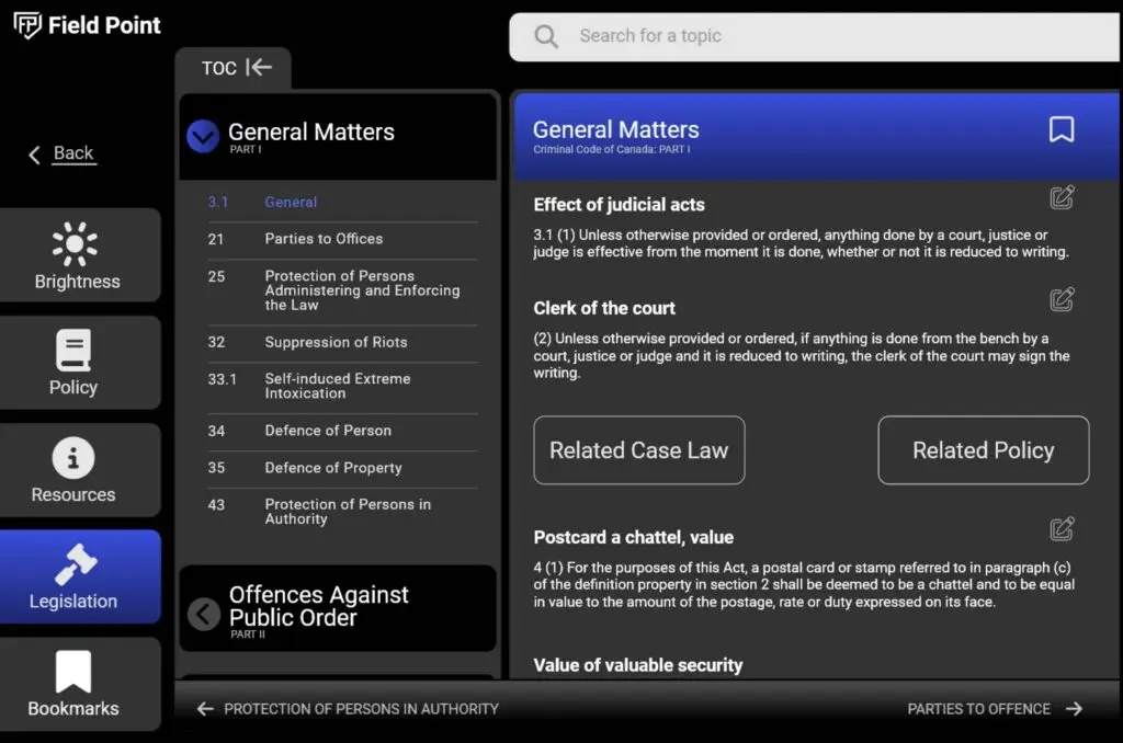
FieldPoint streamlines access to critical information and essential tools, empowering officers to enhance operational efficiency, improve decision-making, and foster safer communities. More than just a software solution, FieldPoint revolutionizes the way law enforcement agencies approach their work, leveraging technology to drive positive change.
The Project
Organization: Provincial and Federal Law Enforcement Agencies
My role: User Experience Researcher, Product Designer, Product Owner
Team: Product Manager, Data Engineer, Data Administrator, 4 Developers, and Product Design and Research
Timeline: December 2022 – Present
Status: MVP V2 Test Release
Goals & User Problems
It’s currently challenging for officers on the road to access essential information stored in user manuals, books, or behind restricted law enforcement firewalls. FieldPoint was created to address this issue by providing officers with easy access to critical information, empowering them to serve the public more effectively.
Project Kickoff
We used a goal-directed design approach for this project, which proved to be very helpful. Qualitative research methods were most useful, literature review, competitor analysis, stakeholder interviews, and especially creating our persona hypothesis. We began by asking some key questions.
Where to Start:
- Who are the primary users and stakeholders?
- What challenges could we face moving forward?
- What do our primary users need most?
- Who do we see as our biggest competititors?
My Process
Empathize
Research my users and their needs and behaviors
Define
Clarify and state users needs and problems
Ideate
Think outside of the box to generate many solutions
Prototype
Visualize solutions to solve the users problems
Test
Test with real users and iterate on the best ideas
Meet The Users
Primary User Persona Findings:
- Demographic: Frontline law enforcement officers, particularly younger officers who are more comfortable with technology.
- Goals: Efficient access to information, improved decision-making, and enhanced job performance.
- Pain Points: Difficulty finding and accessing necessary data, inefficient paper-based systems, and security concerns related to mobile device usage.
- Motivations: To improve public safety, streamline workflows, and stay up-to-date with laws and regulations.
I synthesized data to create user personas: Mark and Lily. These personas, representing our target demographics, guided my design decisions for FieldPoint, ensuring it met their needs.
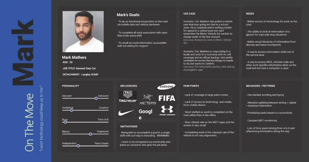
Primary Persona: On The move Mark
- Age: 32
- Job: General Duty Cst.
- Location: Langley PD
Mark needs a better way to source information when on the road. He tries to manage as much as possible from his vehicle and in the moment, rather than waiting for the end of his shift or office time. His technology needs to keep up to the pace of his day!
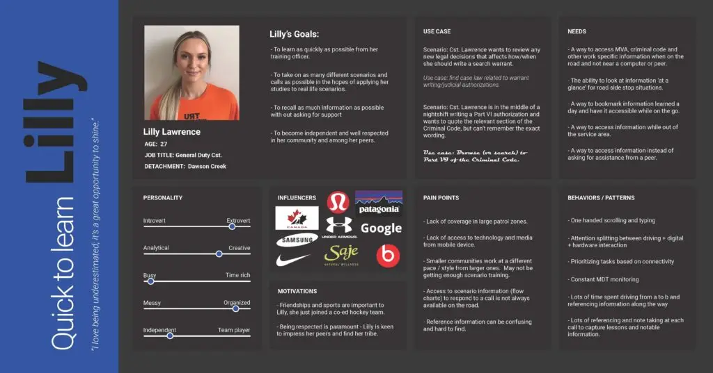
Secondary Persona: Quick to Learn lilly
- Age: 27
- Job: General Duty Cst.
- Location: Dawson Creek PD
Lilly wants to be independent and well-respected in her community and among her peers. She takes on as much as she can so that she can learn from real life scenarios, and tries to recall as much as possible without asking for support.
Persona Hypothesis:
- FieldPoint will significantly improve the efficiency and effectiveness of frontline police officers by providing them with easy access to critical information and tools.
- By addressing the pain points of paper-based systems and security concerns, FieldPoint will enhance job satisfaction and reduce frustration among officers.
- The intuitive interface and user-friendly design of FieldPoint will make it easy for officers to adopt and use the platform, even those who may not be highly tech-savvy.
Competitive Analysis & User Journeys
I analyzed user journeys and competitive apps to identify opportunities in the design. This led to generating feature ideas, which we prioritized based on user needs and creating a development plan.
Insights & Opportunities
- Digital Data Management: Streamline paper-based data, reducing clutter and improving organization.
- Enhanced Accessibility: Access critical information anytime, anywhere, even in areas with limited connectivity.
- Improved Efficiency: Streamline workflows and reduce the time spent on administrative tasks.
- Improved Collaboration: Facilitate collaboration among officers and departments through shared access to information.
The Power of "How Might We"
Once I understood the users’ needs, we generated a range of ideas for new features. Using brainstorming, “How Might We” exercises and prioritization techniques, then selected the most important features for our rapid wireframing. I focused on these essential features to ensure our design aligned with our users’ needs, creating a roadmap for future design.
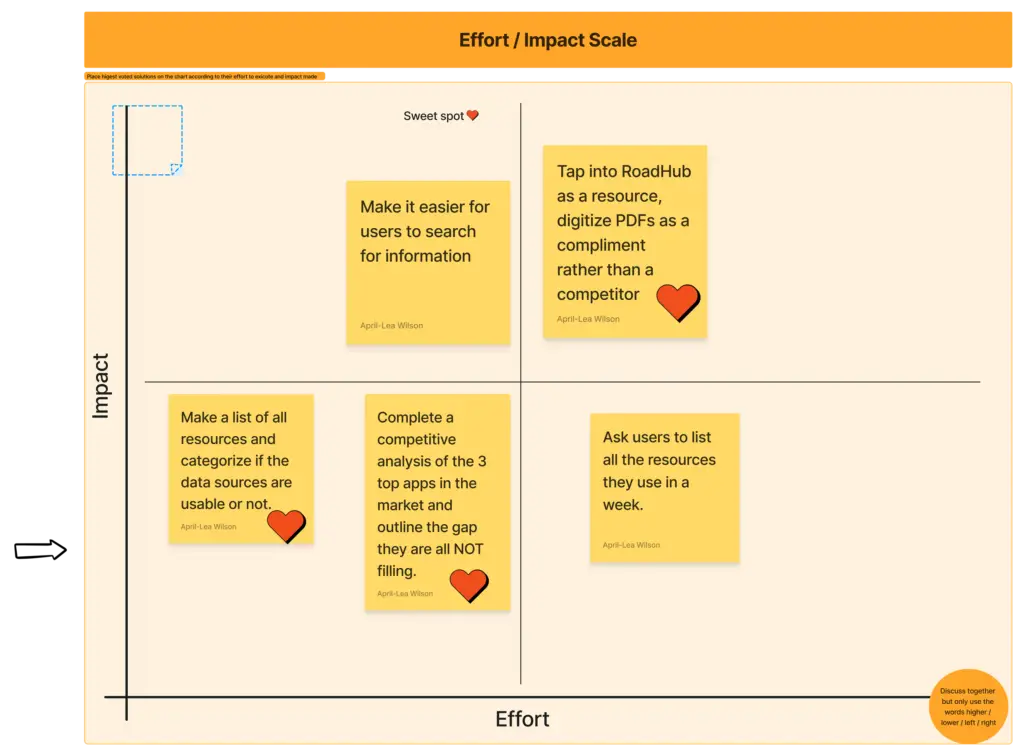
preparing the journey
Visualizing the Golden Path
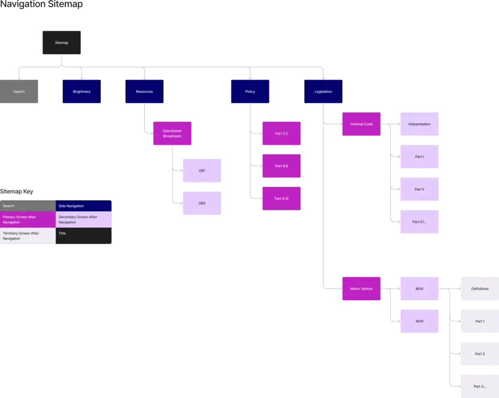
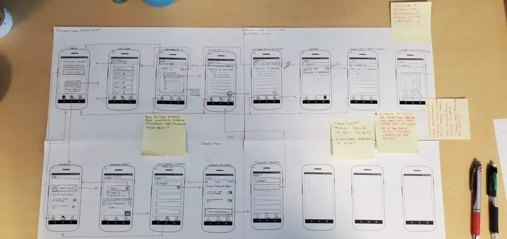
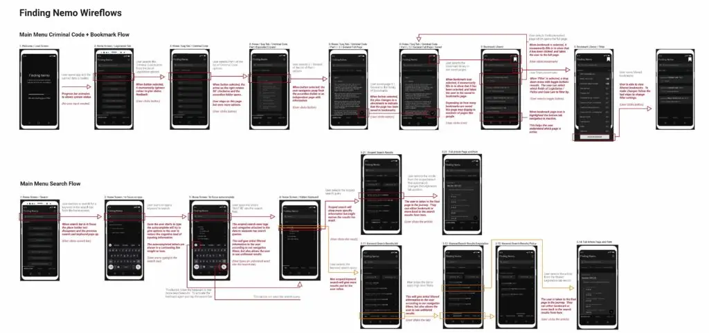
To visualize the user flow and main path through the app, I created wireframes based on the user stories.
- Created low-fidelity wireframes: To visualize the user flow.
- Iteratively refined design: Ensured it met user needs and guided them smoothly.
- Defined ‘golden path’: The ideal user journey.
- Informed MVP features and UX: Before moving to visual design.
Bringing The Design To Life
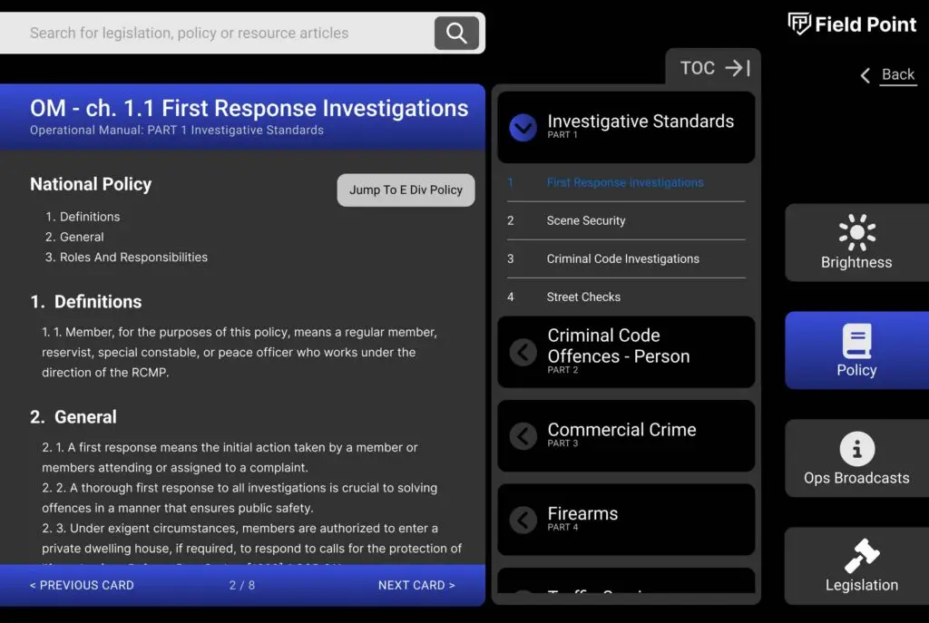
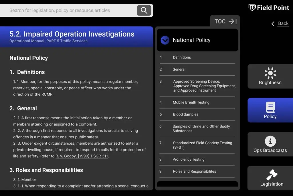
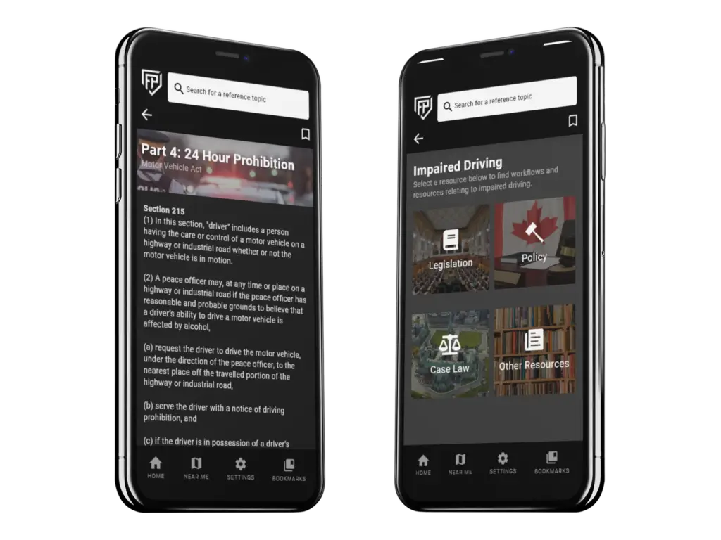
To visualize the design and refine the user interface, I created detailed mockups.
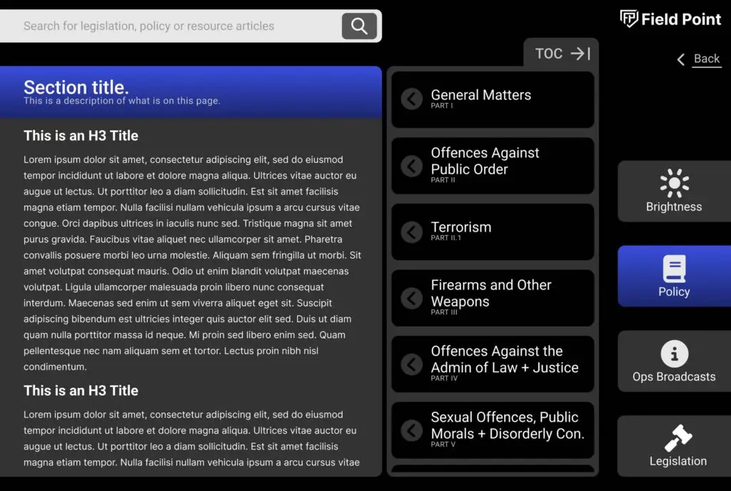
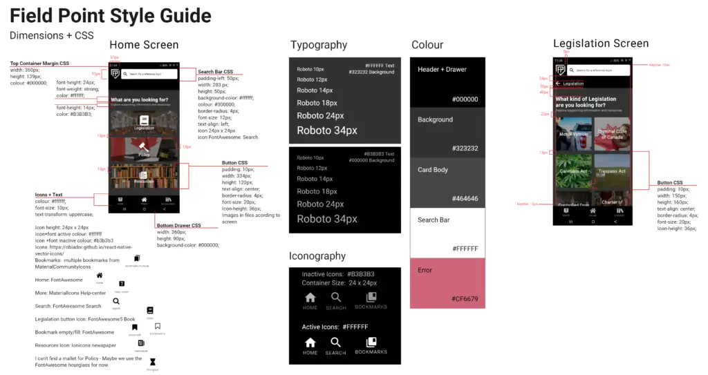
- Defined icon sizes, fonts, and color contrasts: Ensured optimal visual appeal and readability.
- Prioritized dark mode design: Considered users’ nighttime usage habits for improved visibility.
- Informed style guide development: Mockups provided a foundation for creating a consistent visual language in Figma.
This process helped to bring the FieldPoint design to life and ensure a cohesive and user-friendly experience.
Usability Testing Results
Refining The Interface
To ensure FieldPoint was user-friendly, we conducted three rounds of iterative user testing.
- In-house sessions: Five participants completed tasks and provided feedback.
- Field testing: Five Richmond RCMP officers participated in real-world scenarios.
- Observational methodology: We observed users completing tasks and encouraged them to think out loud.
Key Findings and Improvements:
- Search bar visibility: Increased size and contrast for better discoverability.
- Breadcrumb navigation: Replaced with a simple back arrow for easier navigation.
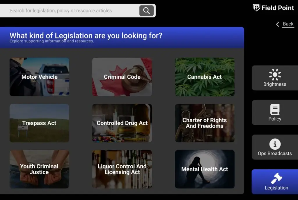
- Home screen navigation: Simplified with a bottom bar and fewer buttons.
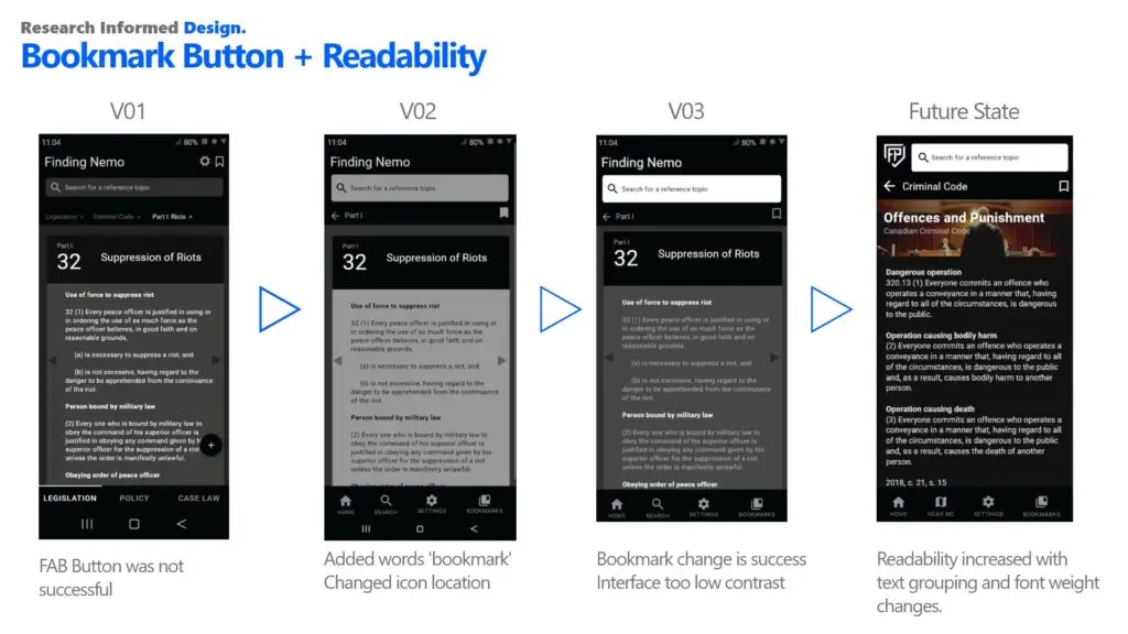
- Bookmark button clarity: Improved placement and icon design for enhanced usability.
Unclear Bookmark
Users struggled to find and use the bookmark button, leading to potential loss of important information.
Confusing Navigation
The home screen slider created confusion and hindered navigation, making it difficult for users to find their way around the app.
Complex Wayfinding
The breadcrumb navigation was overly complex, causing users to become lost and disoriented within the app's hierarchy.
Search Bar Visibility
The search bar was difficult to find and use, preventing users from efficiently locating the information they needed.
Prototype Evolution
Icon Confusion
Participants consistently overlooked the bookmark button, indicating that its contrast or placement was unclear. To improve discoverability I:
- Updated The Icon: Changed the icon from a FAB button to a more common form
- Moved The Icon: Changed the location of the icon from a FAB to a header icon
- Improved Readability: Increased the contrast of the UI on the screen
Navigaiton Troubles
Participants found the home screen navigation slider confusing. To address this issue, I made the following changes:
- Change Slider: Removed the slider system and introduced the bottom drawer navigation
- Add More Common Icons: Added a ‘Home’ button
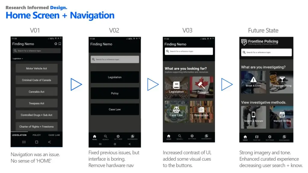
Improved Search & Wayfinding
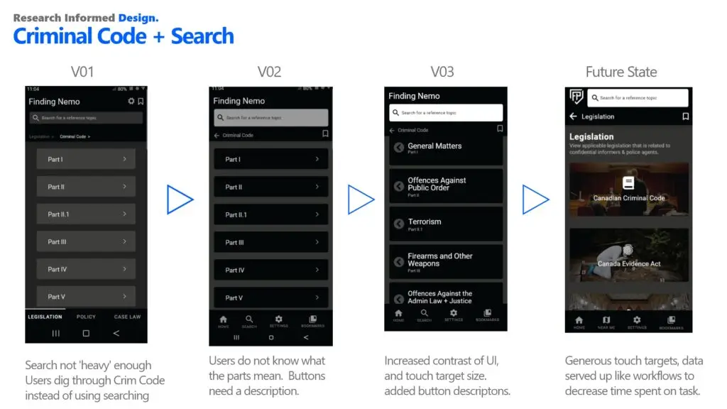
Users struggled with navigating through the app and finding the search function. To improve the wayfinding and search experience, I made the following changes:
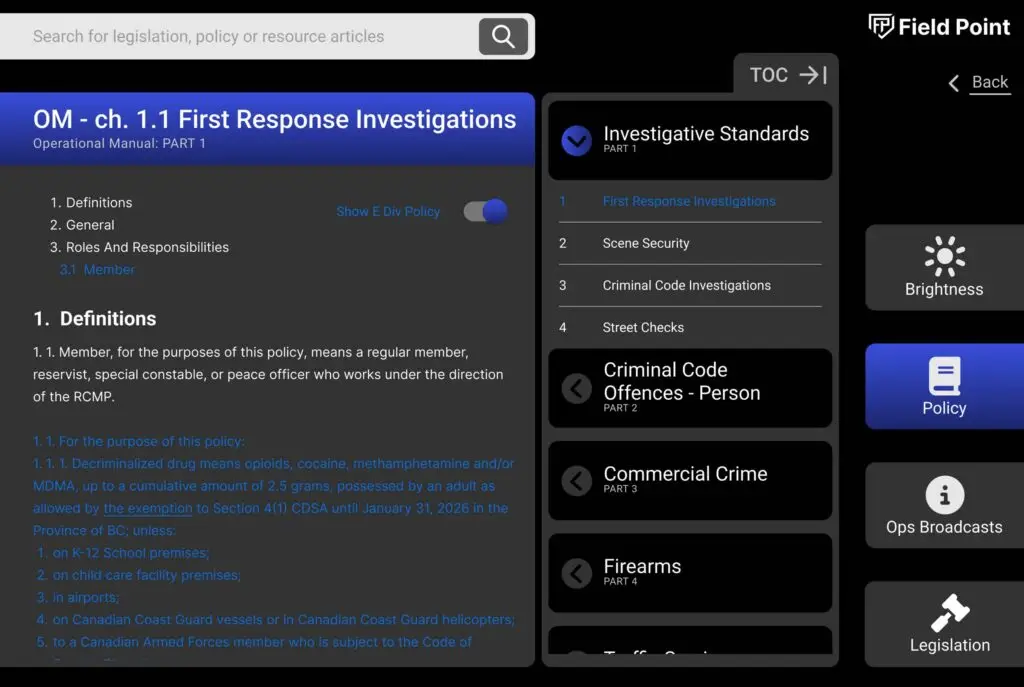
- Prominent Search Bar: Increased the size and contrast of the search bar to make it more visible and easily discoverable.
- Added Back Arrow: Replaced the complex breadcrumb navigation with a simple back arrow to reduce clutter and make navigation more intuitive.
- Create Button Narrative: Increase the size of buttons and add descriptions, icons and images to decrease time reading.
Evolving Needs in Law Enforcement
FieldPoint has emerged as a groundbreaking solution, revolutionizing the way law enforcement officers access and utilize critical information. By leveraging innovative technology and a deep understanding of user needs, FieldPoint has successfully demonstrated its potential to enhance operational efficiency and improve public safety.

Key Achievements:
- Successful Data Summit Presentation: FieldPoint’s presentation at the Federal Data Summit garnered significant attention and recognition, validating its value as a transformative technology.
- Expanded Access to Data Sources: Our efforts to secure access to APIs and data sources have opened doors to new initiatives and traditionally protected data, demonstrating the potential of data-driven solutions in law enforcement.
- Pioneering Data-Driven Policing: FieldPoint is at the forefront of a shift towards data-driven policing, showcasing the value of data-centric approaches and advocating for increased funding and support.
Next Steps:
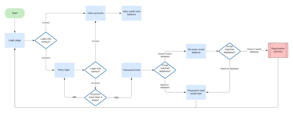
- Feature Enhancements: We will continue to enhance FieldPoint’s capabilities by integrating additional data sources, such as a case law API and expanded process flow charts.
- Platform Adaptability: We will adapt FieldPoint to support both mobile devices and mobile data terminals (MDTs), ensuring compatibility with various operational environments.
- Ongoing Innovation: We remain committed to collaborating with law enforcement agencies to identify and address their evolving needs, ensuring FieldPoint remains a dynamic and indispensable tool.
By focusing on these areas, FieldPoint will continue to drive positive change in law enforcement, empowering officers and fostering safer communities.
